The default dashboard brief is backwards
A stakeholder opens a ticket. Add revenue chart. Then churn. Then active users. Then ageing. Then alerts. Then usage by plan. Then a donut chart because the page looks empty on the right.
Six months later the dashboard is visually impressive and operationally weak. Nobody can remove anything because every tile has an owner, and nobody can say which decision the page as a whole is supposed to improve.
That is the dashboard trap. Information accumulates faster than purpose.
A dashboard is a decision surface
Most people do not open a dashboard because they enjoy metrics. They open it to answer something. Is anything wrong. What changed since yesterday. Where should I spend attention. Which account needs intervention. What caused the variance. What should happen next.
The dashboard earns its space only when it shortens one of those questions.
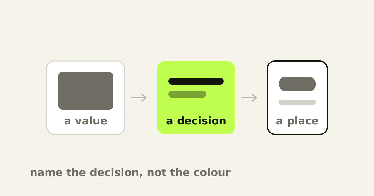
That sounds obvious, and it changes the design sequence completely. The common order is available data, then chart, then layout, then filters, then actions. A stronger order is decision, then evidence, then exception, then action, and the chart last.
Research on user perceptions of dashboard actionability frames the problem around whether dashboards genuinely support decisions for non-expert users. A scoping review of public-health dashboards reached a similar conclusion: usability is necessary, but usefulness, meaning whether the system answers real information needs and supports action, is the harder test. A 2024 experimental study with 524 participants found that characteristics such as information format and completeness influenced decision quality through perceived task complexity.
A clean dashboard can be usable and still fail that test.
If I can read every chart and still not know what deserves attention, the interface optimised comprehension without supporting action.
If I know something is wrong but cannot move from the metric to the affected records, the dashboard created awareness without a workflow. For operational software that is not enough.
Start with a decision inventory
Before designing, interview users with one question repeated aggressively: what decision do you make from this information?
For a finance operations dashboard the list might be which unmatched payments need review first, whether overdue receivables are increasing, which client has a concentration of exceptions, whether yesterday's automation created unusual failures, and whether month-end close is at risk.
Now every block has to justify itself against a decision. If it cannot, it belongs in reporting, or nowhere.
Three layers
I separate operational dashboards into three layers.
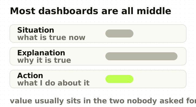
- Situation. What is the current state? A few stable indicators: open exceptions, amount at risk, accounts needing attention, progress to target. Scannable in seconds. 2. Explanation. Why is the state like this? Trend, comparison, segmentation and breakdown, limited to the dimensions that explain movement or help prioritise. 3. Action. What can I do now? Link the summary to the relevant queue, records, workflow or owner.
Most dashboards are overweight in layer two, because charts are easy to request and satisfying to design. Operational value usually lives in layers one and three.
Exceptions beat averages
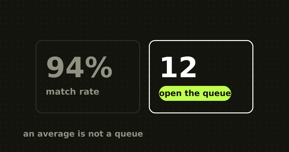
Averages are comfortable. Exceptions are actionable.
A 94 per cent match rate is informative. Twelve payments over ten thousand dollars with no suggested match tells an operator what to investigate. An average response time of three hours forty-two minutes is informative. Eighteen enterprise tickets breaching within the hour creates a work queue.
Dashboards get more useful when the visual hierarchy reflects the cost of inaction rather than the neatness of the metric taxonomy. That usually means fewer charts and more ranked exceptions.
Charts should earn their encoding cost
Every chart asks the user to decode a visual language: position, length, colour, area, scale, axes, legend, time. Sometimes that reveals a pattern much faster than text. Sometimes it turns one number into a puzzle.
Use a chart when the user needs to see trend, distribution, comparison, relationship, or composition where the parts genuinely matter. Do not use one because a metric card looks lonely.
If the decision is whether you are above a threshold, a number plus the threshold may beat a line chart. If the decision is which five accounts need action, a table beats a donut. If the decision is what changed, a ranked variance list beats six sparklines.
Visual sophistication is not the goal. Decision speed is.
Role-based dashboards are not just filtered dashboards
Teams often handle different roles by building one dashboard and hiding modules. That can work, and roles frequently differ in decision horizon rather than only in data access.
An operator cares about the next hour. A manager cares about this week. An executive cares about direction and intervention thresholds. The same metric needs different framing: eight exceptions need review, exception volume is thirty-one per cent above the four-week baseline, automation coverage fell after a migration and close risk is increasing.
Role-based design is about interpretation and action, not simply permissions.
Show the summary first and let users open explanation, comparison and detail as needed. A good dashboard often has less information on first load than the version it replaced, and more accessible depth overall. That is not hiding data, it is preserving attention, and it is the same principle behind designing the empty state before the populated one.
A dashboard audit
Take every card, chart and table, and answer seven questions. Which role needs this. Which decision does it support. What action can follow. How often is the decision made. What happens if the information is missed. Could the same decision be supported with less visual complexity. Does the user need history, comparison, a threshold, or only current state.
Then sort by consequence and frequency. The layout usually changes itself. High-frequency, high-consequence decisions move up, explanatory analytics move deeper, and vanity metrics quietly disappear.
AI makes this more important, not less
AI can generate summaries and charts faster than teams can review them, so the cost of adding representations is falling. The danger is the same as with generated interfaces: abundance gets mistaken for value.
A strong AI dashboard does not create twelve new visualisations. It may remove five by interpreting the data, then expose the evidence behind the interpretation on request. Receivables risk increased this week because three high-value invoices crossed sixty days, and two belong to the same customer, is more actionable than a metric row plus an ageing chart. The charts still exist for verification. They no longer have to be the opening move.
The point
A dashboard is not successful because every important metric is visible. It is successful because the right user notices the right change and makes the right decision with less effort.
Start from the decision. Design the exception. Connect it to action. Then decide whether you still need the chart. Quite often you will not.
Frequently asked questions
- What makes a dashboard actionable?
- It connects a signal to the work the signal implies. An actionable dashboard shows the current situation in a few scannable indicators, explains what changed only where that helps prioritisation, and links directly to the affected records or queue. If a user can read every chart and still not know what deserves attention, the dashboard supports comprehension but not action.
- How many charts should a dashboard have?
- Fewer than most have. Each chart asks the user to decode a visual language, which is worth it only when they need to see a trend, distribution, comparison or relationship. If the decision is whether a value crossed a threshold, a number and the threshold is faster. If it is which accounts need attention, a ranked table beats any chart.
- Why do users export dashboard data to spreadsheets?
- Usually because the dashboard shows state without supporting the decision that follows. If a user can see that something is wrong but cannot filter, sort or act on the underlying records, exporting is the fastest route to the work. That is a sign the missing piece is the bridge from signal to action, not the quality of the visualisations.
- Should dashboards be different for different roles?
- Yes, and the difference is usually decision horizon rather than data access. An operator acts within the hour, a manager within the week, an executive on direction and intervention thresholds. The same underlying metric needs different framing for each, so hiding modules from one shared dashboard tends to under-serve all three.
Sources
This thinking, applied
Share this