The only screen with one hundred per cent reach
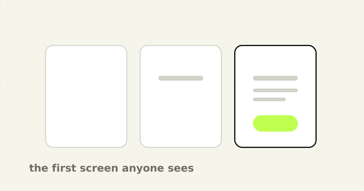
Designers spend weeks on the dashboard with twelve widgets and forty rows. Every new customer sees a different screen first: the one with nothing on it.
That screen is usually built by whoever was implementing the table, in the ten minutes after the table worked. It says "No data" in grey, centred, at 14px. It is the first impression of a product someone has just paid for or just been assigned by their employer, and it is the one screen in the entire application guaranteed to be seen by every single user.
I have never seen an empty state on a design review agenda unless I put it there.
Three different screens wearing the same clothes
Most of the damage comes from treating one situation as three. They need different copy, different actions and often different layouts.
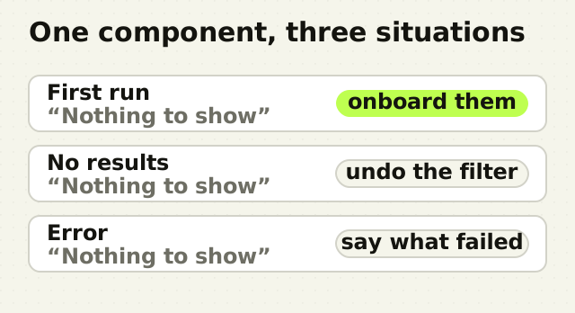
First run. There is no data because the account is new. The user has done nothing wrong and nothing is broken. This is an onboarding surface and the most valuable real estate in your product.
No results. There is data, but the current filter, search or date range excludes all of it. The user has done something, and the right response is to tell them what and offer to undo it.
Error. Something failed. The data may exist and cannot be shown. Saying "No results" here is a lie that sends the user looking for a filter they never set.
A single shared component that renders "Nothing to show" for all three is the most common version of this mistake, and it is worth an hour to split.
"No results" is the correct message in exactly one of the three cases, and it is the message most products use for all of them.
What a first-run state owes the user
The blank dashboard is the moment a new customer decides whether this was a good decision. Four things earn their place.
- A heading that says what will be here, not that nothing is. "No alerts yet" beats "No data", because it names the thing the user came for. 2. One primary action that starts the shortest path to value. Not a tour. Not five setup cards. The single next step. 3. A way to see the product working without committing. Sample data, a demo workspace, an import from the tool they are switching from. Enterprise buyers in particular will not connect production data to something they have not seen work. 4. An honest expectation. "First alerts usually land within a few minutes of connecting a source" prevents the support ticket that says the product is broken when it is merely waiting.
What does not belong: an illustration doing the work of a sentence, a paragraph explaining the value proposition they already bought, and a link to documentation as the only action.
What a no-results state owes the user
This one is mechanical and almost always underbuilt.
Say which constraint excluded everything, and let them remove it in place. "No alerts match high severity in the last 24 hours" with the two filters as removable chips is a complete design. Compare it to "No results", which forces the user to reconstruct their own filter state from memory.
If the search was textual, say what was searched for, because a typo is invisible in a field the user has stopped looking at. Offering a nearby result is better than offering nothing. Offering the number of results without the filter is best of all: "0 here, 47 across all severities" turns a dead end into one click.
Where enterprise products differ
Consumer advice about empty states is mostly about delight, and it does not transfer well to software people use at work.
Permissions are the difference nobody accounts for. In an enterprise tool, empty frequently means "you cannot see this", not "this does not exist". A user with restricted scope who is shown a cheerful "Get started by adding your first integration" will try, fail, and file a ticket. The correct message names the permission and who to ask.
The second difference is that the account is often set up by one person and used by another. The admin who connected the data source is not the analyst who opens the product on Monday. A first-run state written for the person who bought the product will confuse the person who has to use it.
How to get them designed at all
The reason empty states are bad is process, not craft. They are not in the mockup, so they are not in the ticket, so they get invented at implementation time.
- Put every state in the design file next to the populated one. Empty, loading, no results, error, no permission. 2. Make the empty version the first artboard rather than the last. It is the first screen chronologically, and drawing it first tends to improve the populated one. 3. Write the copy in the file. Empty states are ninety per cent writing, and copy invented in a code editor at 6pm reads exactly like it. 4. Add them to review explicitly. Nobody demos the empty state, so nobody sees it until a customer does. 5. Check them against a real new account, not a seeded dev database. Teams almost never look at their own product with nothing in it, which is one more version of the problem I described in why your own team is not a sample.
The point
An empty state is not an edge case. It is the state every account starts in, and for a filtered view it is a state users enter several times a day. Calling it an edge case is how it ends up owned by nobody.
The good news is that this is the cheapest improvement available in most products. There is no architecture to change and no research to run. It is a heading, a sentence and a button, on the one screen you can be certain everybody sees.
Frequently asked questions
- What is an empty state in UX design?
- An empty state is what an interface shows when there is no content to display. There are three distinct kinds: first run, where a new account has no data yet; no results, where a filter or search excludes everything; and an error, where content exists but cannot be loaded. Each needs different copy and a different next action.
- What should an empty state include?
- A heading naming what will appear there rather than what is missing, one primary action that starts the shortest path to value, and where possible a way to see the product working without connecting real data, such as sample content or an import. For filtered views, name the constraint that excluded everything and let the user remove it in place.
- What is the difference between a first-run state and a no-results state?
- A first-run state means the user has no data yet and has done nothing wrong, so it is an onboarding surface. A no-results state means data exists but the current filter or search excludes it, so the right response is to name the constraint and offer to clear it. Using the same message for both leaves users hunting for filters they never applied.
- Do empty states matter for enterprise software?
- More than for consumer products, because empty often means the user lacks permission rather than that no data exists. A cheerful invitation to add the first item will send a restricted user into a flow they cannot complete. Enterprise empty states should name the permission and who can grant it, and should account for the setup user and the daily user being different people.
Sources
This thinking, applied
Share this