Nobody's feedback problem is rudeness
The received wisdom about critique is about tone. Be kind, use "I" statements, praise before criticising. All fine, and it addresses a problem most teams do not have.
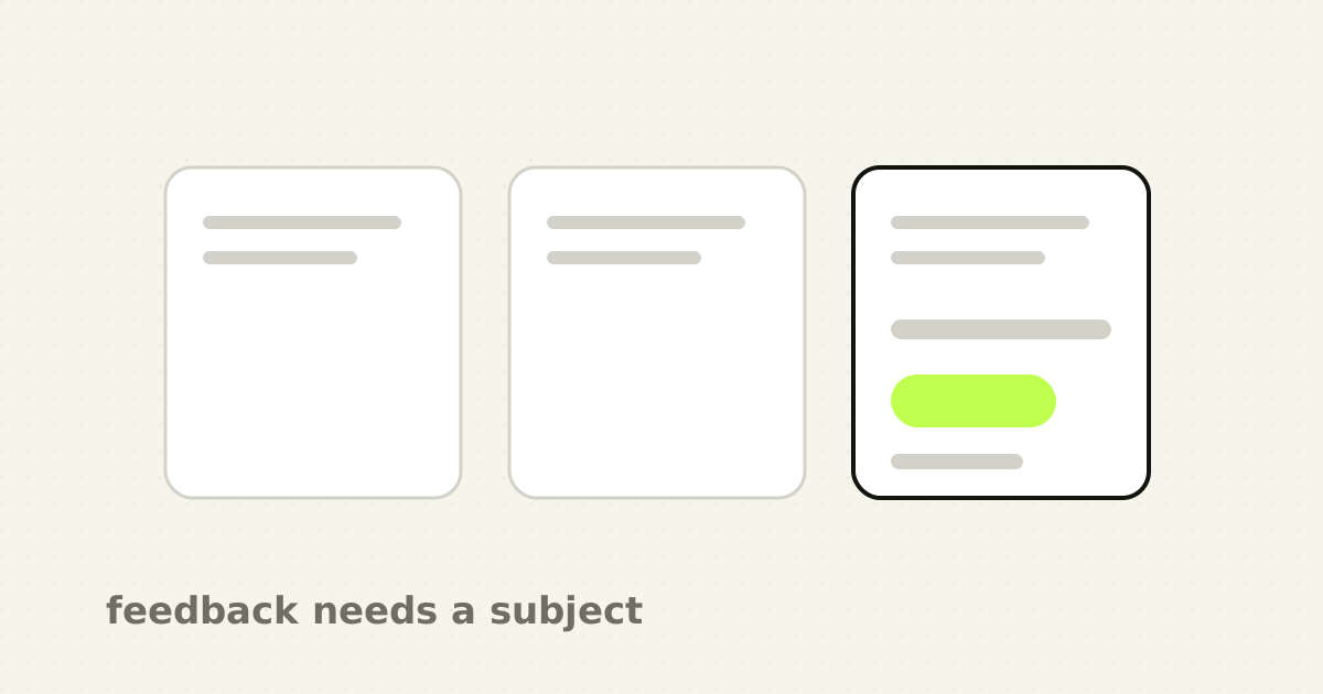
The actual failure is that feedback arrives with no subject. "I don't like the header." "It feels cluttered." "Can we make it pop?" Every one of these describes the reviewer's internal state. None describes the product. The designer is then asked to work backwards from a stranger's reaction to a change, which is guesswork, and the guess gets reviewed by the same person next week.
That is why review cycles run long. Not conflict. Ambiguity.
Three things a piece of feedback needs
A comment is actionable when it contains a user, an action and a consequence.
"An analyst triaging a queue will not see the severity filter, because it sits below the fold at the height most of them run the browser at."
There is a person, a task, a specific element and a reason. The designer can act on it, disagree with it, or check it against research. All three of those are progress. Compare with "the filters feel buried", which supports none of them.
You do not need all three every time. One is usually enough to convert a reaction into a question:
- Which user? Feedback about a screen for administrators, given by someone imagining a first-time user, is a different conversation. 2. Doing what? A layout that works while scanning fails while comparing. 3. With what consequence? Slower, wrong, or stuck are three different severities and they get three different priorities.
The question that rescues most comments is simply: who is this happening to, and what were they trying to do?
Say what you observed before what you would do
The other habit worth breaking is jumping to a fix. "Make the button bigger" hides whatever the reviewer noticed, and it hands the designer a solution instead of a problem. If the observation was that the primary action competes with three secondary ones, there are five fixes and the reviewer has silently picked the least good one.
Report the observation. Offer the fix afterwards, marked as one option. This is not deference, it is information preservation. The designer has context the reviewer does not, and a stated problem lets them use it.
Separate the three kinds of comment
Most bad reviews are actually three meetings happening at once. Naming which one you are in fixes more than any tone guidance.
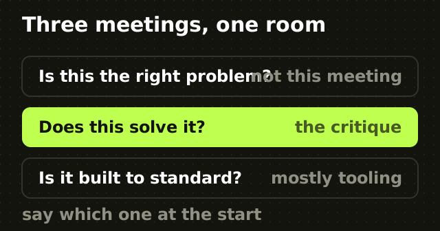
Is this the right problem? Positioning, scope, whether the feature should exist. This is not a design review and it should not be held in one. If it arrives mid-review, stop and reschedule, because everything downstream is now provisional. It is the same failure as starting a redesign before the positioning is settled.
Does this solve the problem? Flows, information architecture, states, edge cases. The core of design critique.
Is this built to standard? Tokens, spacing, contrast, component reuse, accessibility. Checkable against rules rather than argued from opinion, and often better handled by tooling than by people.
Announce at the start which of the three the session is. Half the friction in design review is a participant answering question one while everyone else is on question two.
Preferences are allowed, and must be labelled
A reviewer is sometimes just going to prefer something, and pretending otherwise produces false rigour where people invent user-shaped justifications for taste.
The convention that works is saying so plainly. "This is a preference, not a blocker: I would set the heading a size down." Now the designer can weigh it correctly, which usually means taking it when there is no reason not to and dropping it when there is.
The failure mode is a preference wearing a user's clothes: "users will find this confusing", said by someone with no evidence, about a user group they have never met. That is unanswerable, because disagreeing with it sounds like disagreeing with users. Ask which users and how we would know. Usually the honest answer is that it is a preference, and once labelled it becomes easy to resolve.
Running the session so it ends in decisions
- State the question. Which of the three reviews is this, and what specifically do you want feedback on. 2. Give the context first. Who the user is, what they are trying to do, what constraints are fixed. Most useless feedback comes from a reviewer filling in context they were never given. 3. Let the designer present without interruption, then take comments. Interrupted walkthroughs never reach the states where the problems live. 4. Capture each comment as observation and severity, not as instruction. 5. Close by naming what changes, what does not, and who decides the ones still open. A review that ends without this produces a second review.
The point
Design critique is treated as an interpersonal skill and it is mostly an information-handling one. The comments that move work forward are the ones carrying enough detail for someone else to act, and the comments that stall it are the ones that only describe how the reviewer felt.
You can be entirely blunt and be useful, and you can be perfectly gracious and waste an hour. What separates them is whether the sentence has a subject.
Frequently asked questions
- How do you give useful design feedback?
- Name three things: which user, doing what, and with what consequence. "An admin adding a teammate will miss the role selector because it sits below the fold" can be acted on, checked or disagreed with. "I don't like the layout" cannot, because it describes the reviewer rather than the design. Report the observation before proposing a fix.
- What makes design critique fail?
- Ambiguity more often than conflict. Feedback that reports a reaction without naming a user or a task leaves the designer guessing at what change would satisfy it, which produces repeat review cycles. The second common failure is holding three different reviews at once: whether the problem is right, whether the solution works, and whether the craft meets standard.
- Should design feedback include a proposed solution?
- Report what you observed first, then offer a fix as one option. Leading with a solution hides the observation behind it, and the reviewer may have picked a worse fix than the designer would, since the designer holds context the reviewer does not. Stating the problem lets that context be used.
- How do you handle subjective feedback in a design review?
- Label it. Saying "this is a preference, not a blocker" lets the designer weigh it correctly and usually resolves it in seconds. The problem is not preference itself, it is preference disguised as a user need, which is unanswerable because disagreeing with it sounds like disagreeing with users. Ask which users, and how we would know.
Sources
This thinking, applied
Share this