What does a UX audit include?
Most UX audits arrive as a PDF of forty problems. Contrast is low here, a label is ambiguous there. Every item is true, and the document gets read once and archived, because nothing in it says which problem is costing money. The UX audit deliverables worth paying for look different: fewer findings, each tied to a task someone failed, with the evidence attached and a rank a product manager can defend in planning.
A useful audit includes five things, in this order.
- A statement of what the product is for. The two or three jobs it exists to support, and which one the business earns from. Every finding is scored against this, so it comes first and it is written down.
- Evidence. Analytics to show where people stop, and session recordings or moderated sessions to show why.
- Findings written as broken tasks. Each one names the task, the evidence, and what the failure plausibly costs.
- A ranked fix list, split by effort.
- A walkthrough with the people who will build the fixes.
Everything else, the heuristic scores, the screenshots with red circles, the competitor benchmark, is supporting material. It can be useful. It is not the deliverable.
A heuristic review is one input, not the audit
Nielsen Norman Group describes a heuristic evaluation as a review of an interface against a set of principles, such as Jakob Nielsen's ten usability heuristics, and treats an expert review as the broader version of the same idea. Both are inspection methods. An experienced person looks at the screens and predicts where people will struggle.
That prediction has two limits. First, in Jakob Nielsen's research across six projects, a single evaluator found only about 35 percent of the usability problems in an interface, which is why his method calls for several evaluators working independently. Most audits sold to startups are one person.
Second, a heuristic review never leaves the screen. On a consumer subscription pricing page I worked on, analytics showed where visitors left and nothing about why. Session recordings did: people were comparing plans by scrolling back and forth between them and losing the comparison each time. That failure belongs to a task carried out across several screens, not to any one of them, so no heuristic would have produced it.
What evidence should a UX audit rest on?
Each method answers a different question, which is why a useful audit layers them rather than picking one.
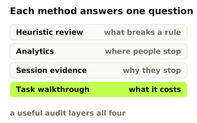
A heuristic review tells you where a screen breaks a known principle. Analytics tell you where people stop. Session recordings or moderated sessions tell you why. Working each task end to end, including the states nobody demos, tells you what the failure costs: the empty account, the partial permission, the slow network, the table with ten thousand rows, the second visit rather than the first.
Evidence is also what changes a brief. On the Symantec CloudSOC redesign, twelve sessions with security analysts changed the direction of the work. Policy creation and alert triage were reworked around how fast a decision could be made under pressure, which is not what the original brief asked for.
The layering matters most when a product has more than one kind of user. Five sessions surface most problems for one group of similar users, but an administrator and a daily user are two groups, and five users is per group, not per study. An audit that samples across roles without saying so is quietly underpowered.
If a provider cannot get access to real sessions or real users, the audit is a heuristic review. That can still be worth buying, but it should be priced and trusted as one.
How should UX audit findings be ranked?
By what each problem costs the business, not by how many were found or how easy they were to spot. Jakob Nielsen's guidance on severity combines three factors: how often a problem occurs, how badly it hurts when it does, and whether people learn their way around it or hit it every time. He adds market impact on top, because some problems matter far more to adoption than their frequency suggests.
In practice I write each finding in the same three parts: the task it breaks, the evidence it rests on, and what it is plausibly costing. "The secondary button has 3.1:1 contrast" is an observation. An illustrative finding reads more like "admins abandon the invite flow at the role step, seen in four of five sessions, which delays every new seat". Someone can argue with that, and the argument is the point.
A ranked list of four findings is worth more than an exhaustive list of forty. The exhaustive one gets read once. The top three on a ranked one are the items to fight about in planning, and a team that fights about them usually ships them.
The UX audit deliverables you should expect to receive
Concretely, the package should contain five things.

- A findings document ordered by cost, whose first page stands on its own for anyone who reads nothing else.
- Evidence behind every significant finding: clips, annotated recordings or quotes. A finding nobody can watch happening is a preference, and it will be treated as one in the room.
- A fix list split by effort: what a front-end engineer can ship this week, what needs a design decision first, and what is a roadmap item wearing a UX costume.
- A recorded walkthrough with the engineers and the product manager who will ship the fixes. Documents get skimmed. The conversation where an engineer pushes back is where a finding turns into a ticket.
- The working material: session notes, the task list and the analytics views used, so the next person can check the work.
For a single product this takes me two to three weeks. A suite of products, or a product with two user types whose tasks barely overlap, takes longer, because each set of tasks has to be worked separately instead of sampled.
What a UX audit should not include
Three things are worth refusing, even when they are offered as extras.
A redesign bundled into the same fee. An audit priced as the front half of a redesign has an obvious incentive to recommend one. Keep the two separate so the findings are allowed to be uncomfortable, including the finding that a redesign is not the fix. Often the honest result is that the problem sits upstream of the interface, which is the argument in your SaaS website probably doesn't need a redesign yet.
A single UX score out of 100. It feels precise and means little, because it adds a typo and a broken checkout into one number.
A conclusion someone already reached. If the decision has been made and the audit exists to confirm it, it cannot change the plan, and an audit that cannot change the plan is an expensive formality.
How to judge a UX audit proposal before you buy
Ask every provider the same five questions and compare the reasoning, not the answers.
- What will you need from us: analytics, session recordings, access to real users?
- How many kinds of user will you cover, and how many sessions per kind?
- How will findings be ranked, and who decides severity?
- What will our engineers receive, and will you walk them through it?
- What happens if you conclude we should not redesign?
A good provider asks you questions back, mostly about what the product is for and which users pay for it. A weak one moves straight to screen count and a delivery date.
The point
The deliverable of a UX audit is not a list of problems. Any competent designer can produce that in an afternoon, and so can a model. The deliverable is a ranked argument about which few problems cost you most, backed by evidence your team can watch, in a form engineers can act on the following week.
If you are weighing one for your own product, the UX audit I run for SaaS and B2B teams sets out the steps, the timeline and the situations it is not right for.
Frequently asked questions
- What is included in a UX audit report?
- A UX audit report should include a statement of what the product is for, the evidence used (analytics plus session recordings or moderated sessions), findings written as broken tasks with the evidence behind each, a ranking by severity and business cost, and a fix list split by effort. A recorded walkthrough with the engineering team is the part most reports skip, and the part that gets findings shipped.
- What is the difference between a UX audit and a heuristic evaluation?
- A heuristic evaluation checks an interface against usability principles, such as Jakob Nielsen's ten heuristics, and predicts where people will struggle. A UX audit uses that as one input and adds behavioural evidence: analytics for where people stop and user sessions for why. A heuristic evaluation reviews screens. A UX audit follows tasks across screens and ranks what their failures cost.
- How long does a UX audit take?
- A UX audit of a single SaaS product usually takes two to three weeks when it includes an analytics review, real user sessions and a ranked findings document. A heuristic-only review can be done in a few days. Products with several user roles, or a suite of several products, take longer, because each role's tasks need their own sessions rather than a shared sample.
- How many users do you need for a UX audit?
- Plan for four to five sessions per distinct user group, not per audit. Jakob Nielsen's model, in which five users find most usability problems, assumes one group of similar users. A SaaS product with administrators, daily users and managers has three groups, so a credible UX audit runs sessions with each, or states plainly which groups it did not cover.
- Should the designer who audits my product also redesign it?
- The same designer can do both, but the audit and the redesign should be scoped and priced as separate pieces of work. A UX audit sold as the first phase of a redesign has an incentive to recommend a redesign. Keeping the audit standalone lets it conclude that the problem is smaller, or not a design problem at all, which is sometimes the most valuable finding.
- When is a UX audit not worth paying for?
- A UX audit is not worth buying when the product has not shipped, when nobody can provide access to real users or session data, or when the decision it should inform has already been made. Before launch, a product design sprint fits better. Without real evidence, the audit becomes a heuristic review and should be priced and trusted as one.
Sources
This thinking, applied
Share this