The most expensive redesign starts with "we've outgrown the look"
A company changes. The homepage does not.
The product moved upmarket while the copy still speaks to everyone. Sales uses language that never appears on the site. A competitor launched a sharper brand. Someone says the website feels dated, and a redesign sounds like the obvious next step.
Then round one arrives and the feedback is not about design. Can we make the hero more enterprise. We also need to mention agencies. This doesn't explain the AI part. Sales wants to lead with compliance. The founder prefers the old headline.
The project has discovered a positioning disagreement after design started billing for it.
Design is downstream of a story
April Dunford's positioning framework is useful because it separates decisions founders often collapse into copy. Positioning depends on the alternatives buyers compare you against, the capabilities you have that those alternatives lack, the value those differences create, the customers who care most, and the market category that makes the value understandable.
Those decisions shape the website. The website cannot make them for you.
A hero headline cannot resolve a disagreement about who the primary buyer is. A new visual identity cannot create differentiated value the product team cannot articulate. Better animation cannot make weak proof credible.
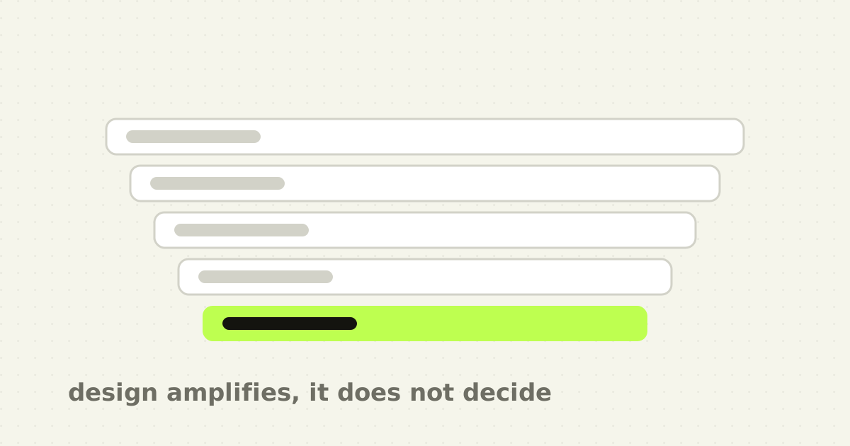
Design can expose ambiguity. It cannot erase it.
The five-layer diagnostic
Before opening Figma, score the site across five layers. Only the last two are design problems.
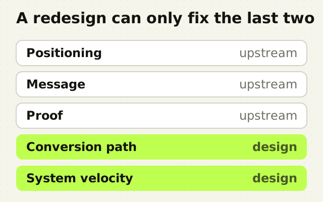
1. Positioning clarity. Can leadership independently answer, in roughly the same words, who the primary buyer is, what they use instead today, what problem is painful enough to change behaviour, what you do differently, why that difference matters, and what category the buyer should place you in? If three stakeholders describe three products, the problem is upstream.
2. Message clarity. Show the homepage to someone who does not know the company. After ten to thirty seconds ask what the product does, who it is for, and what would make them keep reading. Nielsen Norman Group's work on page survival shows how harsh those first seconds are. If the page cannot communicate a value proposition early, users leave. That is a message problem until proven otherwise.
3. Proof quality. What evidence exists beyond assertion? Named customers, specific outcomes, workflow screenshots, before-and-after evidence, security and compliance proof, testimonials attached to a real use case, credible integrations, metrics with context. A redesign cannot manufacture proof. If the page feels unconvincing because the proof is thin, fix the proof first.
4. Conversion path. If the story and proof are strong, can users act without friction? Check the call-to-action hierarchy, demo form length, pricing visibility, the route to self-serve, mobile behaviour, page speed, accessibility, and comparison or use-case navigation. This is where design often genuinely is the bottleneck.
5. System velocity. Can marketing ship the pages it needs without rebuilding the site each time? If every new feature, comparison or industry page becomes a fresh design project, the case for change is operational rather than aesthetic, and a modular system is worth more than another hero concept.
Four situations where I would not redesign yet
- You are still changing ICP every quarter. A polished system built around an unstable audience becomes expensive debt. Keep the site flexible until one buyer dominates the go-to-market motion. 2. No acquisition channel works. A prettier destination does not solve the absence of demand. If nobody reaches the homepage, conversion is not the current constraint. 3. The product story is still being discovered. Pre-product-market-fit teams need clarity, not a full visual system. A large redesign can freeze assumptions that should stay cheap to change. 4. Sales cannot produce proof. If the company has no examples or outcomes, the redesign will fill space with claims. That is a content and customer-success problem first.
Four situations where I would redesign now
- The site undersells a product that already converts in conversation. If qualified buyers understand the value on a call but not on the homepage, the site is failing to carry a story the company already knows how to tell. 2. Paid traffic lands on an unclear page. Now the lack of clarity has a measurable acquisition cost. 3. The company changed category or market. If the site describes the old product, every visitor receives the wrong context. That is not cosmetic drift. 4. Marketing velocity is blocked by one-off design. When the story is stable and demand for new pages is real, a component system produces compounding returns.
Three tests, not one
The stranger test is fast and ruthless: show the homepage without coaching and see whether a cold visitor can explain the claim. I would pair it with two more.
The sales-call test compares the words your best salesperson uses with the words on the homepage. If the strongest objection handling and differentiators never appear on the site, the redesign brief should start from a sales transcript rather than the current layout.
The support-ticket test looks at what users misunderstand after purchase. If the marketing site promises simplicity while onboarding reveals complexity, a new homepage may only raise the wrong expectations. Positioning is not only what earns the click. It sets the mental model for the product that follows.
Once the answer is yes
This article answers whether to redesign. It does not answer what has to be settled first, which is a separate and larger piece of work: the buyer, the alternative, the switch trigger, the value hierarchy, the proof and the claim. That sequence is the positioning work to finish before design starts.
A one-page brief that means you are ready
I would not start a full redesign until the team can fill this page. Primary ICP in one sentence. The current alternative. The costly problem. The differentiated capability. The value that difference creates. The category that makes the product understandable. A hero claim in one memorable statement. Three reasons to believe, as proof rather than adjectives. The primary conversion. And the pages genuinely required in the next six months, meaning real pipeline rather than a hypothetical sitemap.
If the team cannot complete it, the redesign has started too early.
The point
A website redesign is not the moment to discover what the company means. It is the moment to express a meaning the company has already agreed to.
Design deserves to happen once enough strategic ambiguity has been removed that visual choices can amplify something specific. Otherwise the project becomes expensive positioning therapy conducted inside Figma.
Frequently asked questions
- How do I know if my SaaS website needs a redesign?
- Score it across five layers: positioning clarity, message clarity, proof quality, conversion path and system velocity. Only the last two are design problems. If leadership cannot independently describe the buyer, the alternative and the difference in similar words, a redesign will polish that ambiguity rather than resolve it, and the same disagreement will surface in the first review.
- Why do website redesigns fail to improve conversion?
- Usually because they were asked to fix a positioning problem with layout. Every page needs a hierarchy, and hierarchy answers the question of what matters most to a specific buyer. If nobody has decided who that buyer is, the designer decides implicitly and inconsistently, so the site looks better and communicates the same unclear message.
- Should positioning come before website design?
- Yes, because positioning constrains design completely. The alternatives buyers compare you against, the capability that differs, the value it creates and the category you belong to all determine what the page must prove and in what order. A designer given none of that will make those decisions by implication, on every screen, without them being written down anywhere.
- What is the stranger test for a homepage?
- Show your homepage to someone who does not know the company, without introducing it, then ask what the product does, who it is for and what result it promises. Their answer is the page you actually shipped rather than the one you intended. Pair it with a comparison against your best salesperson's language and against what customers misunderstand after purchase.
Sources
This thinking, applied
Share this