The requirement everyone can check and nobody finishes
Contrast is the accessibility criterion with a number attached, which makes it the one that gets done. Paste two hex codes into a checker, get a ratio, ship it.
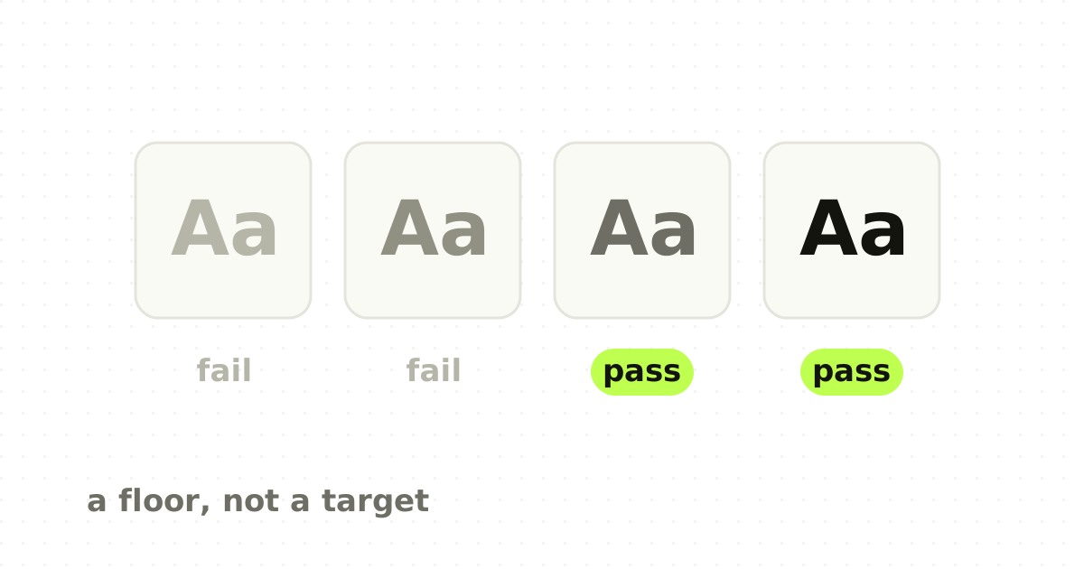
That is genuinely good. It is also why contrast is where accessibility work stops in most teams. The ratio is a floor for legibility under reasonable conditions. Clearing it by a hundredth of a point and calling the text accessible is like passing a crash test at exactly the minimum speed and describing the car as safe.
What the numbers actually are
WCAG 2.2 sets these thresholds for level AA:
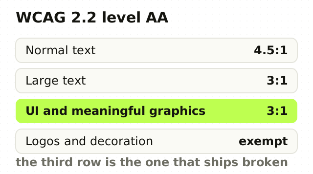
- Normal text: at least 4.5:1 against its background. 2. Large text: at least 3:1. Large means 18.66px and bold, or 24px and up. 3. User interface components and meaningful graphics: at least 3:1. This covers input borders, icons that carry meaning, focus indicators and chart elements.
Level AAA raises text to 7:1 and large text to 4.5:1. Two things are exempt: text in a logo, and text that is purely decorative.
The most-missed item on that list is the third. Teams check body copy and headings, then ship an input whose border is a 1.6:1 grey, which means a low-vision user cannot see where the field is even though the label inside it passes.
What the ratio does not know
The formula compares the relative luminance of two colours. It is deliberately simple, and simplicity costs it several things that decide real readability.
Font weight. A 300-weight at 4.5:1 is materially harder to read than a 500-weight at the same ratio. The maths sees identical colours and cannot tell that one has half the ink.
Size above the threshold. Once you clear the bar, the formula stops caring. In practice 12px at 4.6:1 is a struggle that 16px at 4.6:1 is not.
Hue and how the eye handles it. Two pairs can share a ratio and read very differently, particularly where saturated blues or yellows are involved.
The room. Everyone reviews on a good monitor indoors. The same screen outdoors, on a laptop at 40 per cent brightness in a meeting, or through a matte privacy filter, loses a lot of that margin.
Passing means the text is legible in good conditions for most people. It does not mean it is comfortable, and comfort is what determines whether the text gets read.
The failures I find most often
Not brand colours. Those get scrutinised. It is everything downstream of them.
Placeholder text is the most common failure in any product. It is grey by convention, it frequently sits below 3:1, and in forms that use placeholders instead of labels it is carrying the entire meaning of the field.
Disabled controls are the ambiguous one. Disabled text is exempt from contrast requirements, which teams read as permission to make it invisible. A user still needs to read a disabled button to understand why they cannot proceed. Exempt from the rule is not the same as fine.
Text over images fails in the places the checker never sees, because the ratio changes across the photograph. It needs a scrim or a solid plate, not a hopeful gradient.
Charts fail structurally: series distinguished only by hue, with the legend as the only key. That breaks for colour-blind users regardless of ratio, and the fix is a second channel such as a direct label, a pattern or a shape.
Focus indicators fail more often than anything else, usually because a global reset removed the outline and nothing replaced it.
What to do instead of clearing the bar
- Set your body text well above the minimum. Aim near 7:1 for long-form reading. It costs nothing and removes the whole margin problem. 2. Treat 4.5:1 as the value for text you have deliberately made subordinate, not as the value for text in general. 3. Check components, not just type. Input borders, focus rings, icons, chart series, toggle states. 4. Never let a placeholder carry meaning, and give every field a real label. 5. Give disabled states enough contrast to be read, and carry the disabled meaning with more than colour. 6. Automate the check in CI, so a regression fails a build rather than an audit. 7. Look at the product on a bad screen at low brightness once. It takes ten minutes and will change one of your greys.
Where the standard itself is moving
WCAG's contrast formula is known to be a rough model of perceived contrast, and it treats dark-on-light and light-on-dark symmetrically when the eye does not. Work on a perceptual replacement, most visibly APCA, has been going on for some years and is not part of a ratified success criterion you can be held to today.
The practical position: conform to WCAG 2.2 because that is what standards and procurement reference, and use your judgement about perceived contrast on top of it, particularly in dark mode where the current formula is at its weakest. Do not treat an experimental model as permission to fall below the current requirement.
The point
Contrast is the cheapest accessibility win available and the easiest to mistake for a finished job. The ratio is a floor set for legibility in good conditions, and design happens above floors.
The teams that get this right are not the ones with the best checker in their pipeline. They are the ones who set their default text well clear of the minimum, so that the checker almost never has anything to say.
Frequently asked questions
- What contrast ratio is required for accessibility?
- WCAG 2.2 level AA requires at least 4.5:1 for normal text, 3:1 for large text of 18.66px bold or 24px and above, and 3:1 for user interface components and meaningful graphics such as input borders, icons and focus indicators. Level AAA raises normal text to 7:1. Logo text and purely decorative text are exempt.
- Is 4.5:1 good enough for body text?
- It is the minimum for conformance, not a target. Because the formula ignores font weight, size above the threshold and viewing conditions, text at exactly 4.5:1 can still be uncomfortable at small sizes or light weights. Setting body copy nearer 7:1 costs nothing and leaves margin for low brightness, poor screens and outdoor use.
- Does contrast apply to buttons, icons and borders?
- Yes. WCAG 2.2 requires 3:1 for user interface components and meaningful graphics, which includes input field borders, focus indicators, icons that carry meaning, and chart elements. This is the most commonly missed requirement, because teams check text colour carefully and then ship a form field whose border is barely visible.
- Do disabled elements need to meet contrast requirements?
- Disabled controls are exempt from the contrast minimum, but exempt is not the same as unreadable. Users still need to read a disabled button to understand why they cannot continue. Give disabled states enough contrast to be legible, and signal the disabled meaning with something other than colour alone.
Sources
This thinking, applied
Share this