The tells are specific, and someone counted them
Open ten AI-built products this week and you will see roughly the same page. A dark hero, a headline set in Inter, a gradient sliding from blue into indigo into purple, a Get Started button on top of it. Under the fold: three cards in a row, thin-line icon on each, copy optimised to mean nothing to anyone. Build faster. Ship smarter. None of those products talked to each other, and they arrived at the same design anyway.
This normally gets dismissed as vibes-based griping, so it matters that someone went and counted. Adrian Krebs scored 1,590 Show HN landing pages with Playwright against sixteen DOM and CSS patterns that designers had independently described as tells. The most common was a permanently dark theme at 34% of pages, followed by gradient backgrounds at 27% and icon-card grids at 22%.
Those numbers are lower than the mood around AI design slop suggests, and that is the useful part. No single tell is universal. The fingerprint comes from the stack: a page carrying four or five at once is not following a trend, it is reporting a distribution.
One framework default became a global design language
The blue-to-purple gradient has a traceable origin, which almost no design trend does.
Tailwind CSS shipped its component library with bg-indigo-500 as the accent on effectively every button. Not a considered brand decision, just a neutral placeholder that demoed well. Tailwind then became the most widely used utility framework on the web, and thousands of tutorials, starter repos and half-finished side projects inherited that accent verbatim. All of it went into the scrape.
Adam Wathan, who created Tailwind CSS, said it plainly in 2025: "I'd like to formally apologize for making every button in Tailwind UI bg-indigo-500 five years ago, leading to every AI generated UI on earth also being indigo."
A framework default became a convention, then a statistical habit, then what modern means to a system that has never read a design brief.
Why models land on the median
The mechanical explanation matters here, because "the AI has bad taste" is not quite right. A language model generating an interface is predicting the most likely continuation given a prompt. When the prompt is underspecified, and "make it clean and modern" is about as underspecified as a brief gets, nothing in it breaks the tie between a thousand viable directions. The model falls back to the centre of its training distribution, which is the design equivalent of averaging everything it has ever seen.
That centre is by construction the least surprising output available. It is built to be inoffensive. Inoffensive and interesting are different targets, and only one of them is being optimised for.
The convergence is measurable, not just anecdotal
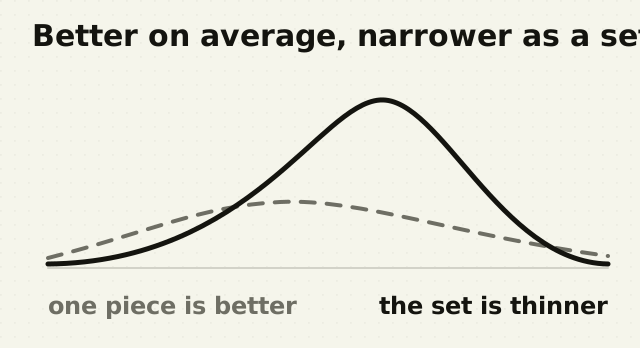
Anil Doshi and Oliver Hauser ran the cleanest test of this I know of, on writing rather than interfaces. Writers given generative AI story ideas produced work rated as more creative and better written, with almost the entire gain landing on the least creative writers in the sample. Individually, the tool worked.
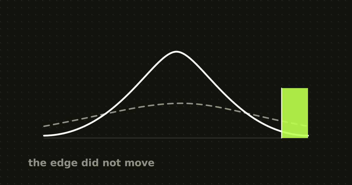
Collectively it did the opposite. The AI-assisted stories were measurably more similar to each other than the unassisted ones. The floor came up and the range contracted at the same time.
It generalises to design without much strain. Every founder using an AI tool gets a better landing page than they would have built alone, and the set of all those pages is narrower than the set they would have produced without it.
What actually scales is adoption
This is where calling it a scaling problem earns its keep, though it pays to be exact about what scales. It is not compute: more GPUs do not make AI design slop worse on their own. What scales is adoption, and adoption turns a one-time bias into a compounding one. Every AI-generated page published to the open web becomes a candidate training example for the next model, which teaches the next generation that this design is more typical than before.
Researchers call the general version of this model collapse. The 2024 Nature paper by Ilia Shumailov and colleagues showed that when a model is trained on data generated by earlier models, the rare long-tail examples thin out with each cycle and the system contracts toward an ever-narrower average. They found the defects irreversible without fresh human data.
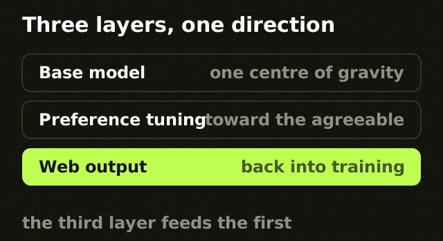
So here is the test I would apply, and the reason this deserves the name. A capability problem gets better with scale. This gets worse with scale. Three layers push the same direction at once: the base model reaching for the statistical centre, the preference-tuning layer rewarding the familiar over the distinctive, and the open web feeding AI output back into training. All three strengthen as usage grows.
Convergence is old, the friction is new
Design converging on a shared default did not start with AI, and pretending otherwise weakens the argument. Bootstrap-era sites all had the same navbar. Material Design turned thousands of independent Android apps into visibly the same app. Templates have always pulled toward a mean, because copying something that works is cheaper than inventing something that might.
What changed is the friction. Copying required a person to notice a trend, like it, and choose to imitate it, a process with natural drag in it. Now convergence is the default weight of the system before any human makes a choice at all. You no longer decide to imitate the trend, you have to actively fight the model to avoid it. That inverts who does the work of introducing variation, and it is most of why the sameness arrived so fast.
Better prompts fix your page, not the pool
Specific prompting genuinely works at the level of one output. Name the typeface, the palette, the grid and the motion, and you give the model something other than the training average to anchor on. I am not going to pretend otherwise.
But that fixes one designer in one session. It does not change what the next model learns is typical, nor what tens of thousands of people are generating in parallel with the defaults intact. You can design your way out of AI design slop for your own product while the ecosystem average keeps drifting toward it.
The durable fix is not a better prompt, it is a constraint the tool has to work inside. A defined token set, a fixed type scale and a component library are exactly that. When I built a shared component and token system across five product lines, the point was never visual consistency for its own sake. It was that the decision had already been made, so nothing downstream got to re-decide it badly. That is what stops a generator reaching for the median: not taste applied afterwards, but a system that makes the median unavailable.
Actionable takeaways
- Decide your typeface, palette and radius before you open an AI tool, and put them in the prompt as constraints rather than preferences. 2. Audit your own output against the known tells: dark hero, blue-to-purple gradient, Inter, three icon cards, glass panel, badge above the headline. 3. Spend the time the tool saved on the parts that carry identity: the copy, one custom interaction, and the imagery. 4. Write the constraints down where the next person and the next tool will both read them, because a decision living only in someone's head gets re-decided by whatever the model suggests.
The point
The current wave of AI design tooling is not stuck here because nobody has thought to fix it. It is stuck because every part of the pipeline is doing exactly what it was built to do, quietly and correctly, and the sum of those correct behaviours is convergence.
So the sameness is not a bug waiting on a patch. It is the priced-in cost of optimising a creative discipline for speed and consensus. The same logic applies to choosing AI imagery over stock photography, where the default is similarly cheap and similarly generic.
The interesting question was never how to stop the model producing the median. It is what you are willing to decide before you ask it anything. Most teams have not written that down, which is the real reason their product looks like everyone else's. Settling it is the first thing I do in a product design engagement.
There is a second version of this problem inside AI products rather than around them, where the output people rate highest is the one they should question most. I wrote about that in why confident AI answers produce worse decisions.
Frequently asked questions
- What is AI design slop?
- AI design slop is the generic, convergent visual style produced by AI coding and design tools when given an underspecified brief. Its usual markers are the Inter typeface, a blue-to-purple gradient, a permanently dark hero section, three rounded feature cards with thin-line icons, and a frosted glass panel. The term describes output that is competent and completely undifferentiated.
- Why do AI-generated websites always use purple gradients?
- Tailwind CSS used bg-indigo-500 as the default accent colour in its component library. Tailwind became the most popular utility framework on the web, so tutorials, templates and open-source projects reproduced that accent thousands of times, and all of it became training data. Tailwind's creator Adam Wathan publicly acknowledged the connection in 2025.
- Does better prompting fix AI design sameness?
- Specifying typography, colour, grid and motion produces a genuinely more distinctive single result, because it gives the model an anchor other than its training average. It does not fix the underlying problem. Prompting changes one output, not what the next generation of models learns is typical, and not what everyone else is generating with the defaults left in place.
- What is model collapse?
- Model collapse is the degradation that occurs when AI models are trained on data generated by earlier AI models. According to the 2024 Nature paper by Ilia Shumailov and colleagues, the rare examples in the tails of the original distribution disappear with each training cycle, and the model contracts toward a narrower average. The paper describes the defects as irreversible without fresh human data.
- Does AI make designers less creative?
- Research by Anil Doshi and Oliver Hauser found the opposite at the individual level: writers using generative AI produced work rated as more creative, with the largest gains going to the least creative participants. The collective result reversed, because the AI-assisted outputs were measurably more similar to each other. Individual quality rose while overall diversity fell.
- How do I make an AI-built site not look AI-built?
- Decide the typeface, palette, spacing scale and corner radius before prompting, then supply them as hard constraints. Ban the known tells explicitly, including gradients and stock icon grids. Use the model for conventional scaffolding and spend the saved time on copy, one distinctive interaction, and original imagery. A defined design system beats prompt wording every time.
Sources
This thinking, applied
Share this