Onboarding is judged on one moment
A new user signs up for a reason. They want to send the first invoice, see their own data in the dashboard, publish the first page, or reconcile the first payment. SaaS onboarding UX is everything between the signup and that moment, and it succeeds or fails on one question: how many people get there.
Most onboarding is designed around a different question, which is what the team wants the user to know. So it becomes a sequence of screens explaining the product: here is the sidebar, here is the settings menu, here is where reports live. All true, and none of it is the thing the user came to do.
Tours are the most skipped thing you will build
Nielsen Norman Group's research on onboarding tutorials is blunt about why this fails. Tutorials interrupt people who want to start, they show information out of context, and whatever they explain has to be remembered until it is needed, which it rarely is. In NN/g's testing, deck-of-cards tutorials did not improve task performance, and even skipping one costs a tap.
The alternative NN/g recommends is contextual help: a short hint at the moment someone reaches the feature it describes, when they are motivated to read it. That shifts the design question from "what should the tour say?" to "where does this person get stuck, and what would they need at that exact point?"
Find the first value moment before designing anything
Before drawing a screen, write down the first value moment in one sentence. For an invoicing product it might be "the first invoice sent to a real client". For an analytics product, "a chart of the user's own data". For a team tool, "a teammate replies to something".
Then trace every step between signup and that moment. That list is usually longer than anyone expected, and each step on it is a place where trial users leave. Onboarding design is mostly the work of making that list shorter.
Cut, defer or prefill every step before adding help
Take each step on the path and ask three questions, in this order.
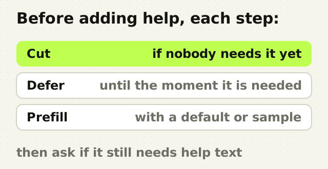
- Can it be cut? Company size, job title and how the user heard about you rarely need asking before they have seen anything.
- Can it be deferred? Billing details, team invitations and integrations can wait until the user needs them, and asking at that point converts better because the reason is obvious.
- Can it be prefilled? Sample data, a sensible default, or a template gives the user something to react to instead of a blank form. Defaults do a lot of quiet work in a product, which is the argument in Loom was won in the settings menu.
Only what survives all three needs designing, and only then is it worth asking whether it needs help text.
Branch once, early
Different people sign up for different reasons, and one path rarely fits all of them. A single early question, such as "are you setting this up for yourself or for a team?", or "what do you want to do first?", lets the product send each person down a shorter path to their own first result.
Branch once. A questionnaire of six questions before the product appears is its own onboarding problem. One or two questions that change what the user sees next are worth asking. Questions that only feed a marketing segment are not.
The empty workspace is the onboarding
After signup most products show an empty workspace, and that screen does more onboarding than any tour. An empty table with no guidance tells a new user nothing. An empty state that explains what will appear here, offers one clear first action, and perhaps shows sample data does the job a tour was trying to do, in context and at the moment it matters.

That is why the empty state deserves designing first rather than last. On a first run it is the product's best chance to show what it is for.
The same logic applies to upgrade moments. On an AI interview coach, the whole feedback system was given away free and the paywall moved onto the job people have a deadline for, which puts the value moment before the payment ask rather than after it.
Measure activation, not completion
Tour completion rate is the wrong measure, because a user can complete a tour and still leave. Measure the share of new signups who reach the first value moment, and how long it takes them. Then look at where the rest stop, and watch a few of them trying, because the analytics will show where people leave and only a session will show why.
When that number moves, onboarding is working. When only the tour completion rate moves, the team has made the tour easier to click through.
The point
Onboarding is not a tour of the product. It is the shortest path from signup to the first thing the user came to do, with everything else cut, deferred or prefilled, and help offered only where someone is actually stuck.
Frequently asked questions
- Why do SaaS trial users not activate?
- SaaS trial users usually fail to activate because the path from signup to the first useful result is too long. They are asked for details, shown a product tour, and dropped into an empty workspace before seeing anything worth staying for. Shortening that path, by cutting, deferring or prefilling steps, does more for activation than better tutorial copy.
- Do product tours improve onboarding?
- Product tours rarely improve onboarding on their own. Nielsen Norman Group's research found that tutorials interrupt users, show information out of context, and did not improve task performance in testing. Contextual help, shown at the moment someone reaches a feature, is generally more effective because the user is motivated to read it.
- What is the first value moment in SaaS onboarding?
- The first value moment is the point at which a new user gets the result they signed up for, such as sending a first invoice, seeing their own data in a chart, or receiving a reply from a teammate. Defining it in one sentence gives the onboarding a measurable goal and shows which steps before it can be removed.
- How do you measure SaaS onboarding?
- Measure the share of new signups who reach the first value moment, and the time it takes them. Tour completion and step completion rates are weak measures, because a user can finish a tour and still leave. Pair the activation rate with session recordings of users who stopped, to see why they stopped where they did.
- Should onboarding be personalised?
- Light personalisation helps. One early question about role or goal can send each user down a shorter path to their own first result. Long questionnaires before the product appears do the opposite. Ask only questions whose answers change what the user sees next, and defer the rest.
Sources
This thinking, applied
Share this