The 1.2x decision
Atlassian acquired Loom for roughly $975 million, closing in late 2023, with around 25 million users across 1.8 million workplaces. Async video was not a novel idea when Loom launched, and screen recording had been solved for two decades. What Loom got right was a series of decisions small enough to be invisible on a roadmap.
Loom ships video playback at 1.2x by default. Not 1x, not 1.5x. Growth.design's teardown of Loom frames this through status quo bias, our documented tendency to accept whatever state we are handed rather than change it.
Consider what that setting does. Every recipient of every Loom watches slightly faster than real time without deciding to. Across millions of videos, that is a meaningful reduction in the total time cost of the product's core action, applied to everyone, extracted from a decision nobody made.
The choice of 1.2 specifically matters too. Growth.design notes the constraint: push the speed further and voices start to sound unnatural, which is a cost the viewer does notice. So the number sits at the boundary of imperceptibility. Fast enough to compound, slow enough that nobody opens the menu.
Your default is not a preference, it is your product
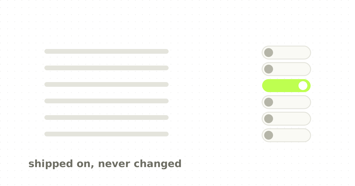
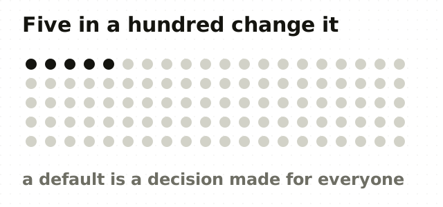
This is the part teams consistently underweight. A settings menu creates the impression of user choice while the overwhelming majority of behaviour is determined by whatever value shipped. Studies of desktop software have put the share of users who meaningfully change settings below 5%, and the classic organ-donation research found opt-out countries with participation above 90% against opt-in countries below 20%. Same decision, same people, different default.
If almost nobody changes a default, then the default is not configuration. It is the behaviour of your user base, chosen by you, at design time. That reframing has consequences: a bad default is a bug that shipped to 100% of users, not a preference some will adjust. Defaults deserve the same scrutiny as features. The default should serve the median user, not the power user who will find the menu anyway.
And any default that benefits you more than the user is a dark pattern wearing a settings label, regardless of how easy it is to turn off.
Most enterprise software fails this test badly. Notification frequency, default sharing scope, default date ranges, what gets emailed to whom: all shipped on whatever seemed reasonable during implementation, and none of it revisited. It is the same failure mode as design tokens nobody consumes, where a decision made once quietly governs everything downstream.
Reveal the interface as it earns relevance
Growth.design highlights Loom's use of progressive disclosure: the initial view shows very little, and reactions and comment affordances appear once playback has actually started.
The reasoning is cognitive load. A first-time viewer arriving at a shared link has exactly one job: press play. Every control visible but irrelevant at that moment is noise competing with the one action that matters. Growth.design also notes Loom's alignment with mental models borrowed from YouTube and Twitch, so the viewer does not have to learn a new video interface on top of everything else.
There is a related point about redundant calls to action. Stacking multiple prompts for the same outcome does not multiply conversion; it produces banner blindness, and people stop seeing the whole region. One clear ask beats three competing ones.
Prompts land better when the user started them
Growth.design describes Loom's use of self-initiated triggers: prompts that appear as a consequence of something the user just did, such as reacting during a video, rather than arriving unbidden.
The distinction is about attribution. An interruption you did not cause is an interruption. A prompt that follows your own action reads as the system responding to you, and it inherits the intent you already had. Same modal, entirely different reception.
This is one of the cheapest improvements available to most B2B products. Take your existing prompts and, instead of firing them on a timer or a page load, attach them to the action that makes them relevant. Very often the prompt does not need rewriting at all, only rescheduling.
The 13% that came from removing a blank box
The most concrete number in Growth.design's breakdown: a 13% increase in comments from a change to how Loom handles the end of a video, using a pre-filled response and requiring signup at the point of reply.
Two principles are stacked here. Reciprocity: someone has just spent time recording something for you, and there is a genuine social pull to acknowledge it. And the removal of a blank-page problem: a prefilled starting point converts composing a response into confirming or editing one, which is a far smaller task.
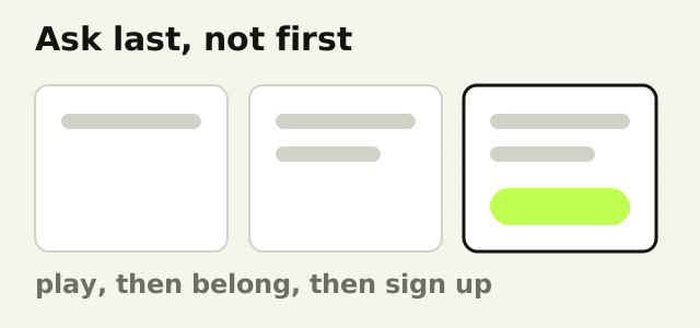
Note also where the signup requirement sits. Not at the link, not before playback, but at the moment the viewer has already decided to reply. Account creation is attached to intent the user generated themselves, which is the self-initiated trigger applied to the conversion step.
Vanity is a legitimate growth lever
The last item in Growth.design's analysis is the one most likely to be dismissed in a planning meeting: for a product where sharing means putting your face and voice in front of colleagues, how good the interface makes you feel is a growth input, not a cosmetic one.
Friction reduction is the usual framing for adoption work. But motivation is the other half of the equation, and for anything involving self-presentation, aesthetics are motivation. If a tool makes people feel unprofessional, they will not share its output, and sharing is the entire distribution mechanism.
What to take into your next sprint
- Audit every default in your product. List them. For each, ask who benefits and whether the median user would have chosen it. Expect to find several nobody has thought about since launch.
- Set one default at the edge of imperceptibility. Find your equivalent of 1.2x: a change that improves the experience without registering as a change.
- Delay the second-order UI. Anything not required for the primary action should appear after that action has begun.
- Reattach your prompts to user actions rather than to load events or timers.
- Pre-fill anything you are asking someone to compose. Confirmation is a smaller ask than composition.
- Move signup to the point of intent, not the door.
- Treat visual quality as a distribution input wherever the user's output carries their name.
The point
Loom's growth story reads like an argument for taste in small decisions, and that kind of design judgment becomes more valuable, not less, once AI can execute routine interface work almost instantly. No single item in this list would survive prioritisation on its own merits, and the compounded effect was a $975 million outcome. The same is true of Duolingo's retention sequencing: the mechanics are ordinary, the ordering is not.
The uncomfortable implication is that the highest-leverage work in your product this quarter is probably already shipped, sitting in a settings file, chosen by nobody in particular. Auditing exactly that is one of the first things I do in a product design engagement.
Frequently asked questions
- Why are default settings so important in UX design?
- Because almost nobody changes them. Estimates of desktop software use put meaningful settings changes below 5% of users, so whatever ships becomes the behaviour of nearly everyone. That makes a default a product decision rather than a configuration option, and a poorly chosen one is effectively a bug delivered to your entire user base.
- What is status quo bias in product design?
- Status quo bias is the tendency to prefer things to stay as they are. Changing a setting requires effort and a decision, and a pre-selected option carries an implicit signal that it is recommended. The result is consistent gravity toward whatever the product shipped with, regardless of whether it suits the individual user.
- How do I choose a good default value?
- Pick the value that serves the median user rather than the power user, who will find the menu anyway. Test it as you would a feature. Keep the escape hatch obvious for the minority who want something else. And refuse any default that benefits your metrics more than the user, however easy it is to switch off.
- What is progressive disclosure and when should I use it?
- Progressive disclosure means revealing interface elements only as they become relevant. Loom shows almost nothing until playback begins, then introduces reactions and comments. Use it whenever a screen has one obvious primary action: controls that are visible but irrelevant compete with that action and increase cognitive load without adding capability.
- Are defaults a dark pattern?
- Only when they serve you at the user's expense. A default that saves time or matches what most people would have chosen is good design. A default that quietly opts users into data sharing, billing or notifications they would decline if asked is manipulation, and the presence of an off switch does not change that.
- When should a product ask users to sign up?
- At the point of demonstrated intent, not at the entrance. Loom requires an account when a viewer has already decided to reply to a video, which produced a 13% lift in comments alongside a pre-filled response box. Gating before the user has any reason to want the outcome converts a warm action into a cold one.
Sources
This thinking, applied
Share this