Why most UX audit checklists do not help
Search for a SaaS UX audit checklist and you will find lists of thirty, fifty or a hundred items. Are the buttons consistent. Is the contrast sufficient. Is the navigation clear. Every item is reasonable, and a team that works through one ends up with a long list of small true things and no idea which of them is costing customers.
The problem is the unit. Those checklists inspect screens. People do not use screens, they carry out tasks that cross several of them, and the expensive failures live in the gaps between. A checklist that ranks has to start from the task.
This is the self-serve version of how I run the evidence side of an audit. It will not replace watching real users, but it will get a product team from "the UX feels off" to a ranked list they can argue about.
Step one: list the tasks, not the screens
Write down the three to five tasks your product exists to support. Not features, tasks: invite a teammate, import the first data set, approve a payment, find last month's report, triage today's alerts.

Mark the one the business earns from. For most SaaS products that is the task that turns a signup into a retained account, and it gets checked first and most thoroughly.
If the product has distinct roles, such as an admin who sets it up and a daily user who works in it, list tasks per role. They are separate audits sharing a document.
Step two: run seven checks on every task
Walk each task end to end, in the product, with realistic data. For each one, ask seven questions.
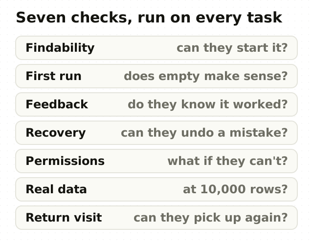
- Findability. Can someone who has never been shown the task find where it starts? Try it from the home screen, not from a link someone sent.
- First run. What does the task look like with no data yet? An empty table with no guidance is where many first sessions end, which is why the empty state deserves designing first.
- Feedback. After each step, does the person know it worked? Silent saves, spinners with no end and success that looks identical to failure all fail this check.
- Recovery. Can a mistake be undone, and does the error message say what to do next rather than what went wrong internally?
- Permissions. What does the task look like for someone who is not allowed to finish it? A greyed-out button with no explanation reads as a bug.
- Real data. Does the task still work at your largest customer's volume? A queue that is clear with twelve rows can be unusable with twelve thousand, which is the situation security analysts on CloudSOC faced every day.
- Return visit. When someone comes back tomorrow, can they pick up where they left off, or do they start again?
Record each result as pass, partial or fail, with one sentence on what you saw. The sentence is what makes the finding usable later.
Step three: score what fails
A list of fails is still a list. To rank it, score every failure on the three factors Jakob Nielsen uses for usability severity: how often it happens, how badly it hurts when it does, and whether people learn their way around it or hit it every time.
A simple way to run it is to score each factor from 1 to 3 and multiply. A failure that is frequent, blocking and permanent scores 27. A cosmetic issue on a screen people see once scores 1. The arithmetic is crude on purpose, because its job is to force a conversation about the top five, not to produce a precise number.
Then sort by score and by the task's value to the business. A partial failure on the money task usually outranks a full failure on a settings page.
Step four: sweep with the heuristics
Once the tasks are done, make one pass over the product with Nielsen Norman Group's ten usability heuristics. Several of them overlap with the seven checks, since visibility of system status is the feedback check and user control and freedom is the recovery check. The sweep catches what the tasks did not reach.
Add an accessibility pass. WCAG 2.2 is the current W3C standard, and contrast is the check teams most often treat as a box to tick when 4.5 to 1 is only the floor.
Keep the sweep's findings in a separate section. They are real, and they are usually lower-cost than the task failures above them.
What a checklist cannot tell you
A checklist run by your own team finds what your team can see. Your team knows where everything is, uses clean data and has never been confused by its own naming, so the problems a newcomer hits are exactly the ones insiders walk past. Nielsen's research found that a single evaluator catches only about a third of usability problems, and a team auditing its own product is a single evaluator with extra blind spots.
The checklist also cannot tell you why. It shows where a task fails, not what the person was thinking when it did. For that you need session recordings or a handful of moderated sessions per role.
That is the line between a checklist and a full UX audit with evidence and a ranked argument. The checklist is worth doing either way. It makes the audit cheaper, and sometimes it makes one unnecessary.
The point
A long checklist feels thorough because it is long. What makes a checklist useful is that it produces a short list, ranked by what each failure costs, that a team can act on next sprint.
Start from the tasks, run the same seven checks on each, score what fails and fix from the top. If the top of your list is still an argument after that, that is the moment an outside audit earns its fee.
Frequently asked questions
- What should a SaaS UX audit checklist include?
- A SaaS UX audit checklist should list the three to five tasks the product exists for, then check each one for findability, first-run state, feedback, error recovery, permissions, performance at real data volume and the return visit. Add a sweep against Nielsen Norman Group's ten usability heuristics and an accessibility pass against WCAG 2.2, and score every failure so the list can be ranked.
- How do you prioritize UX issues found in an audit?
- Score each UX issue on frequency, impact and persistence, the three factors Jakob Nielsen uses for usability severity, then weight the result by the value of the task it affects. An issue on the task that turns signups into retained accounts outranks a worse issue on a rarely used settings page. Fix from the top, and keep cosmetic issues in a separate list.
- Can we do a UX audit ourselves?
- A product team can run a useful self-audit with a task-based checklist, and it is worth doing before paying anyone. The limit is perspective: insiders know where everything is and miss what confuses newcomers. A self-audit finds where tasks fail. Watching real users, through session recordings or moderated sessions, is still needed to learn why they fail.
- How many tasks should a UX audit cover?
- Cover three to five core tasks per user role. Fewer misses the tasks that matter, and more spreads the effort so thinly that nothing gets checked end to end. Start with the task the business earns from, usually the one that turns a signup into a retained account, and check it more thoroughly than the rest.
- Does a UX audit include accessibility?
- A UX audit should include at least an accessibility pass against WCAG 2.2, the current W3C standard, covering contrast, keyboard access, focus visibility and form labelling. A full accessibility audit with assistive-technology testing is a separate, deeper piece of work, but skipping accessibility entirely leaves out problems that affect a meaningful share of every product's users.
Sources
This thinking, applied
Share this