The 62-hour lesson
In 2024, Spotify leaned hard on generative AI, including an AI-hosted podcast built with Google's NotebookLM that narrated your listening habits back to you. It also quietly dropped popular elements like top genres. The reaction was poor: users described it as impersonal, and it took Wrapped 62 hours to reach the 200 million engaged users that the 2025 edition reached in 24.
That is a roughly 19% year-over-year improvement in first-day engagement, achieved mostly by putting back what had been removed. Spotify also reported over 500 million shares in 2025, up 41%. For 2025 the company kept AI in the pipeline but took it off the stage, shifting the experience toward comparison and social play: a listening age, a Wrapped group, and a live multiplayer Wrapped Party.
The lesson for product teams is precise. Wrapped does not work because it is data, and it does not work because it is automated. It works because it is a story about the person reading it. Automate the pipeline all you like; the moment the automation becomes the experience, the thing stops being personal and starts being generic.
Anticipation is designed, not accumulated
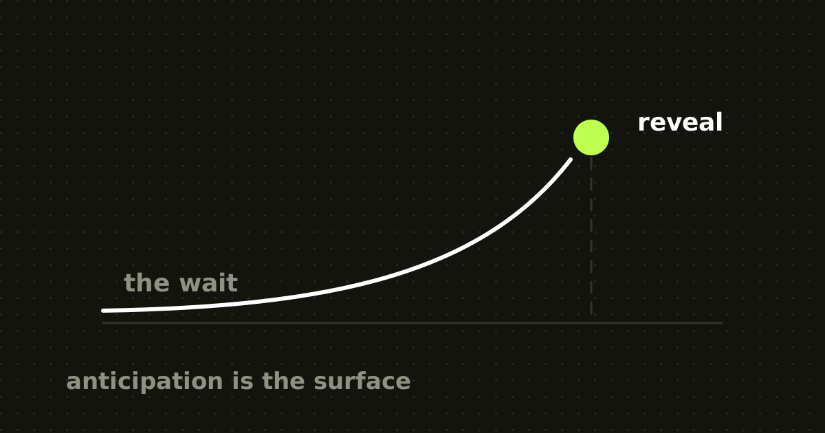
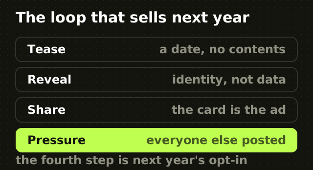
Growth.design's teardown of Spotify Wrapped points out that the first touchpoint arrives roughly a week before anything is revealed. That prompt contains no information. Its entire function is to open a curiosity gap, the discomfort we feel when we know a piece of information exists and we do not yet have it.
Two things follow. The first is that the gap has to be specific to be uncomfortable: telling someone their year in review is coming works because they know the answer exists and concerns them. A vague teaser does nothing. The second is that the campaign has trained a calendar expectation. People now anticipate Wrapped months out, to the point that Growth.design notes some users adjust their listening mid-year with the December reveal in mind.
That last detail is worth sitting with. The anticipation is now shaping behaviour inside the core product for eleven months of the year. Very few marketing surfaces do that.
Uncertainty is what makes the reveal worth watching
A reveal you can predict is not a reveal. Growth.design flags variable reward as central to Wrapped: you genuinely do not know which artist tops your list, and the possibility of an embarrassing or surprising result is part of the appeal.
This is why the usage-stats dashboards inside most products generate no excitement. They are available continuously, so nothing accumulates and nothing is uncertain. Wrapped withholds. The withholding is the product decision.
If you want the effect, you need a real information asymmetry: something the system knows about the user that the user does not already know about themselves, held until a moment you control.
Data is not a story until it is about the reader
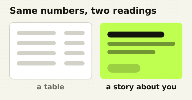
The single most copyable thing about Wrapped is the framing. Growth.design's analysis highlights how Spotify converts raw counts into narrative, tying minutes listened to memories and personal growth rather than presenting them as usage metrics.
The reframe is doing heavy lifting. A five-figure minutes-streamed total is, read plainly, a slightly alarming screen-time statistic. Rendered as a sentence about your year, it becomes something you want to show people. Same number, opposite emotional valence. Growth.design calls this out as a framing effect, and it is the difference between a report and a keepsake.
The practical version for your product: never ship the table. Ship the sentence the table implies, with the number as the punctuation. The same discipline applies to dashboards people read under pressure, where a raw count and its interpretation are very different products.
Sharing works because it is identity, not statistics
Wrapped is shared because music is a claim about who you are. Growth.design ties the scale of it to the bandwagon effect: once enough people post, posting becomes the default behaviour, and not posting starts to feel like abstaining. Research on the phenomenon points to optimal distinctiveness, the simultaneous desire to belong and to stand out, which a personalised chart satisfies in a single image.
Notice the loop closes on itself. The people who see everyone else's Wrapped in December are being recruited into next year's cohort, which is precisely why the anticipation mechanic compounds instead of decaying. The friction on sharing is near zero, and the artefact is pre-formatted for the platforms it will land on. That is deliberate design work.
It is also fragile. Reporting on the 2025 edition noted users finding artists they had never heard of in their results, including acts they had explicitly muted. When the data is wrong, the identity claim collapses and the share does not happen. Personalization that is inaccurate is worse than none, because it publicly misrepresents the user.
How to build one that works
- Withhold something real. Find a calculation you can make about a user that they cannot make about themselves, and stop showing it continuously.
- Open the gap a week early with no content in it. The tease should confirm that something specific exists, and nothing more.
- Write the sentence, not the row. Every metric ships with the human meaning attached. If you cannot write that sentence, the metric is not ready.
- Make accuracy a launch blocker. A wrong top item is not a rounding error, it is a broken identity claim. Validate against the messiest accounts you have.
- Design the share artefact first: aspect ratio, legibility at thumbnail size, and what it says about the person posting it.
- Keep AI in the pipeline, off the stage. The 2024 edition is a clean natural experiment in what happens when the automation becomes the interface.
- Ship it on the same date every year. The compounding only starts once people expect it.
The point
Wrapped is often described as a marketing campaign. It is more accurate to call it a retention feature with a publication date. The waiting, the uncertainty and the framing are the product, and the underlying data is unremarkable, which is exactly why the pattern travels. The same ordering logic shows up in Duolingo's retention machine.
You almost certainly have the data. What you probably do not have is the discipline to sit on it until December.
Frequently asked questions
- Why is Spotify Wrapped so popular?
- Wrapped combines a week of engineered anticipation, genuinely unpredictable results, and statistics reframed as a personal story. Because music signals identity, sharing the result says something about the poster rather than about Spotify. Once enough people share, the bandwagon effect makes posting the default and recruits next year's participants.
- What is the curiosity gap in marketing?
- The curiosity gap is the discomfort of knowing that a specific piece of information exists about you while not yet having it. Spotify opens one roughly a week before Wrapped launches with a teaser containing no actual content. The gap only works when it is specific: a vague announcement produces no tension and no return visit.
- Why did Spotify Wrapped 2024 get criticised?
- The 2024 edition leaned on generative AI, including an AI-hosted podcast summarising listening habits, and removed popular elements such as top genres. Users found it impersonal. It took 62 hours to reach 200 million engaged users, a threshold the more human-centred 2025 edition crossed in 24 hours.
- How do I build a year-in-review feature for my product?
- Find a calculation you can make about users that they cannot make themselves, then stop showing it continuously so it accumulates. Tease it about a week ahead with no detail, frame every number as a sentence about the reader, design the shareable image first, and treat data accuracy as a launch blocker.
- Should I use AI to generate personalised content?
- Use it in the pipeline, not as the interface. Spotify's 2024 experiment made the AI itself the experience and engagement suffered; the 2025 edition kept AI behind the scenes and recovered. Automation that computes personalisation is invisible and useful. Automation the user has to interact with reads as generic.
Sources
This thinking, applied
Share this