The sparkle icon is doing too much work
Open ten AI products and you find the same grammar. Sparkle icon. Ask AI button. Prompt box. Suggested prompts. Streaming answer. A regenerate action underneath.
That pattern makes sense for a chat assistant, because conversation is the product. It makes much less sense copied into invoicing, recruiting, security operations, reconciliation, analytics and every other category.
A finance manager does not wake up wanting to chat with an accounts-receivable model. They want to clear exceptions before 9:30.
An AI product succeeds when the intelligence improves that job, not when the model gets maximum screen time.
Start with the shape of the task
Google's People and AI Guidebook starts from user needs rather than model novelty. Anthropic's guidance on building agents makes a similar point from the engineering side: use the simplest solution that works, and add complexity only when it measurably helps.
So the first question is what shape the user's task has.
If the task is exploratory, conversation may fit. Researching an unfamiliar topic, drafting and revising, brainstorming, interrogating a dataset with unpredictable questions. The user does not know the path in advance, so language is a natural control surface.
If the task is structured, a workflow usually fits better. Approving invoices, matching payments, reviewing candidates, triaging alerts, categorising tickets, completing compliance checks. The user already knows the task, so making them narrate it to a model adds interaction cost. Here AI should appear as a suggestion, a ranked option, a pre-filled decision, an anomaly flag or a background action, not a blank prompt.
Three levels of visibility
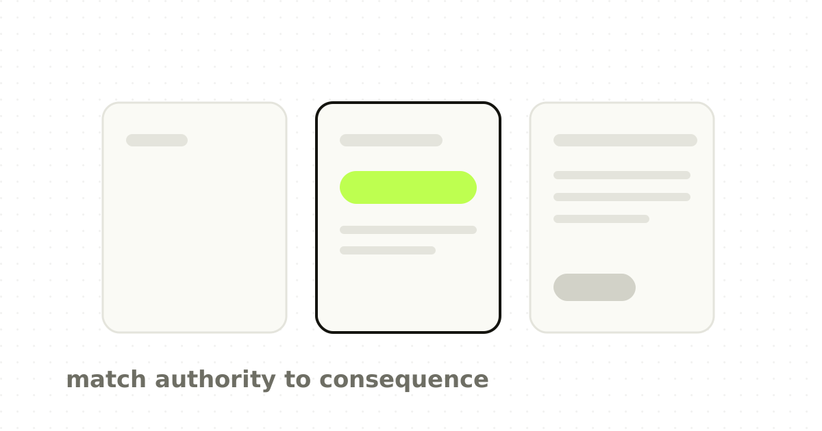
If the AI is always invisible, users cannot build an accurate mental model of what happened. If it is always visible, the product feels like operating machinery. The useful boundary is uncertainty and consequence.
Microsoft's Guidelines for Human-AI Interaction tell designers to make clear what the system can do and how well, support efficient correction, scope services when uncertain, explain important behaviour and provide controls. That suggests three levels.
- Invisible assistance. Use when consequence is low, output is easy to verify and recovery is cheap. Query expansion in search, smart ordering, autofill, background classification that does not commit a decision. 2. Visible recommendation. Use when the AI changes what the user sees or considers, confidence matters, and the action is still reversible. A likely match, a suggested response, a potential duplicate. The interface should show why the suggestion exists and make correction cheap. 3. Explicit approval and supervised automation. Use when actions carry financial, legal, security or data consequences, when several downstream records change, or when recovery is costly. Now you need preview, scope, confirmation, an audit trail and reversal.
Confidence is not a decorative percentage
Teams often answer uncertainty by showing 92 per cent confident. That number creates false precision if the user does not know what it means.
Google's explainability guidance is careful here: show confidence only when it helps a user decide how much to trust a result, and explain in a way that supports their mental model rather than exposing model internals.
For most B2B products a categorical, action-linked treatment is more useful than a score. High confidence, ready to approve. Needs review, amount differs by 2.1 per cent. Low confidence, no invoice shares this supplier reference.
The important part is not the score. It is what the user should do differently because the confidence is lower.
Explain at the level the job requires
AI selected this based on your data is not an explanation. Neither is dumping model reasoning into a drawer.
Good explanation is task-specific. A reconciliation product might say the match was suggested because amount, currency and payer reference agree, while the payment date is three days later than expected. A recruiting product might say the candidate was surfaced for six years of relevant experience, with the location requirement unconfirmed.
That tells the operator what matched, what did not, and where human judgment remains. It supports a decision without turning the product into a debugging console.
Agentic work needs blast-radius design
Agents change the problem, because the model is no longer only generating content. It is taking actions.
Anthropic's production guidance warns about compounding errors and recommends sandboxing, guardrails and human checkpoints. Its work on trustworthy agents describes moving from approving every small step toward reviewing plans and intervening when necessary.
For agentic workflows I would design five controls before designing any chat surface.
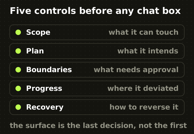
- Scope. What systems, records or time range can the agent touch? 2. Plan. What does it intend to do before it starts? 3. Boundaries. Which actions happen automatically, and which always require approval? 4. Progress. What has happened, what remains, and where did it deviate? 5. Recovery. How do we reverse or repair consequences?
Without those, a conversational interface only makes the autonomy feel friendly. It does not make it safe.
Approval is not control if everyone clicks yes
One of the more useful lessons from agentic systems is that more confirmations do not necessarily mean more safety. Anthropic reported that permission-heavy interaction created approval fatigue in Claude Code, with users approving the overwhelming majority of prompts, and that reducing needless prompts became part of improving oversight.
That generalises. If your finance product asks for approval on eighty low-risk suggestions, the user is more likely to approve the eighty-first high-risk one on autopilot.
Good control separates routine from consequential. User attention is a limited safety resource, and it should be spent where the blast radius is larger. This is the same calibration problem I wrote about in why the AI features people rate highest can be the ones that mislead them.
The chat box test
Before adding a chat surface, ask whether the user knows the exact task they want to perform, whether it could be represented more efficiently with structured controls, whether natural language removes complexity or merely hides it, how users will verify the result, what happens when the model misunderstands intent, whether the action can be reversed, and whether the user needs conversation or the product team needs somewhere to put AI.
If the task is predictable and the output structured, chat is often an unnecessary layer.
AI as a colleague, not a performance
A good colleague does not interrupt every thirty seconds to announce that they are using intelligence. They prepare the obvious work, flag uncertainty, ask when judgment is needed, show enough context to review the result, and leave a trace of what changed.
That is a useful model. AI can be present without being theatrical. The strongest signal of a mature AI product may be that users stop describing the experience as using AI and start describing the job as faster and less tedious.
The point
The design question is not where can we put AI. It is where does intelligence reduce work, and where does uncertainty require human attention.
Chat is one answer. Agents are another. Suggestions, ranking, classification, pre-fill, background automation and structured review are others.
The best interface matches the task and the consequence, even when that means the AI almost disappears.
Frequently asked questions
- Does every AI product need a chat interface?
- No. Chat suits exploratory tasks where the user does not know the path in advance, such as research, drafting or open-ended analysis. For structured work like approving invoices or triaging alerts, the user already knows the task, so requiring them to describe it to a model adds effort. There, AI works better as suggestions, ranking, pre-fill or background classification.
- How should an AI feature communicate confidence?
- Usually not as a raw percentage, which most users cannot calibrate and which implies precision the number does not carry. Categorical and action-linked treatments work better: ready to approve, needs review because the amount differs, low confidence because nothing matches this reference. The user needs to know what to do differently, not what the score was.
- What controls does an agentic AI feature need?
- Five, before any conversational surface: scope defining what it can touch, a plan shown before it acts, boundaries separating automatic actions from those needing approval, visible progress including deviations, and a recovery path to reverse or repair consequences. Without these, a friendly chat interface makes autonomy feel safe without making it safe.
- Can too many approval prompts make an AI product less safe?
- Yes. Anthropic reported approval fatigue in Claude Code, where permission-heavy interaction led users to approve the large majority of prompts, and reducing unnecessary prompts became part of improving oversight. Confirming eighty low-risk actions makes it more likely someone approves the eighty-first high-risk one without reading it.
Sources
This thinking, applied
Share this