Every product nudges, so that cannot be the test
Designers get uneasy about influence, which produces a useless conversation. Ordering a list is influence. Choosing which action is primary is influence. Writing a button label is influence. There is no neutral interface, and a designer who claims to have built one has just stopped noticing their own choices.
So "does this influence the user" cannot separate good design from bad. It returns yes every time. The question has to be sharper than that, and it has to be answerable in a design review by someone who was not in the room when the decision was made.
The test is what the answer you do not want costs
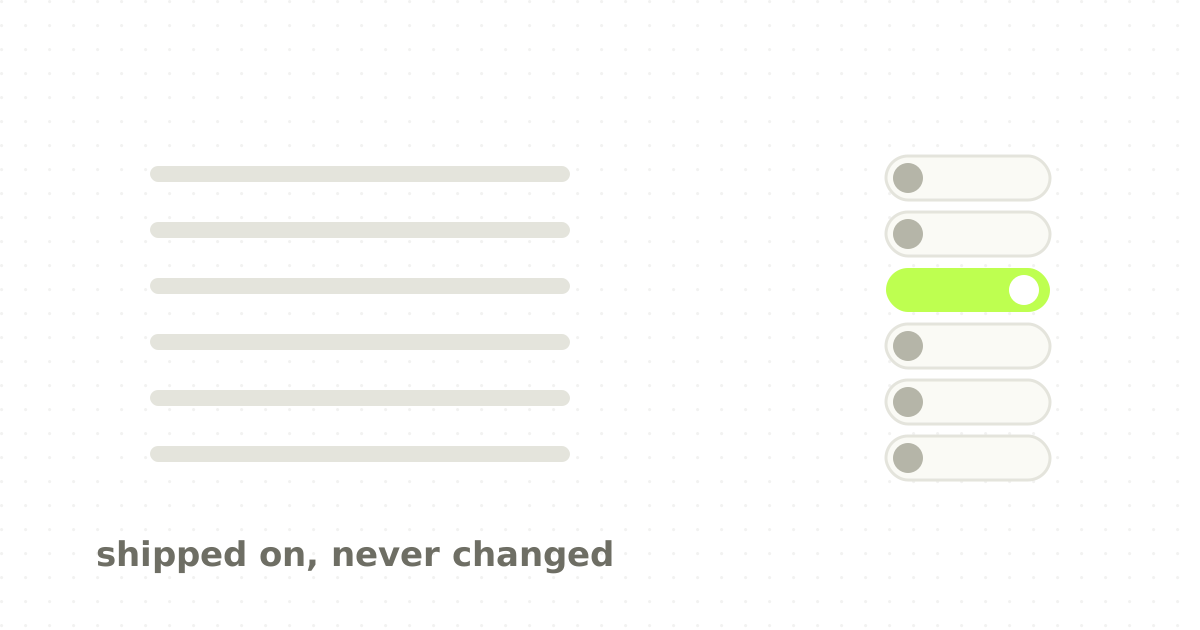
Look at the outcome your business wants, then look at the opposite outcome, and compare what each one costs the user in taps, reading and time.
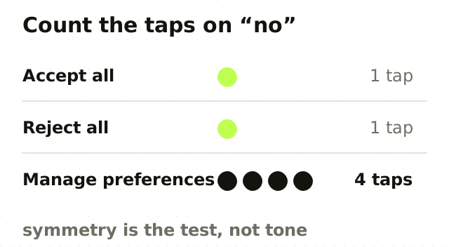
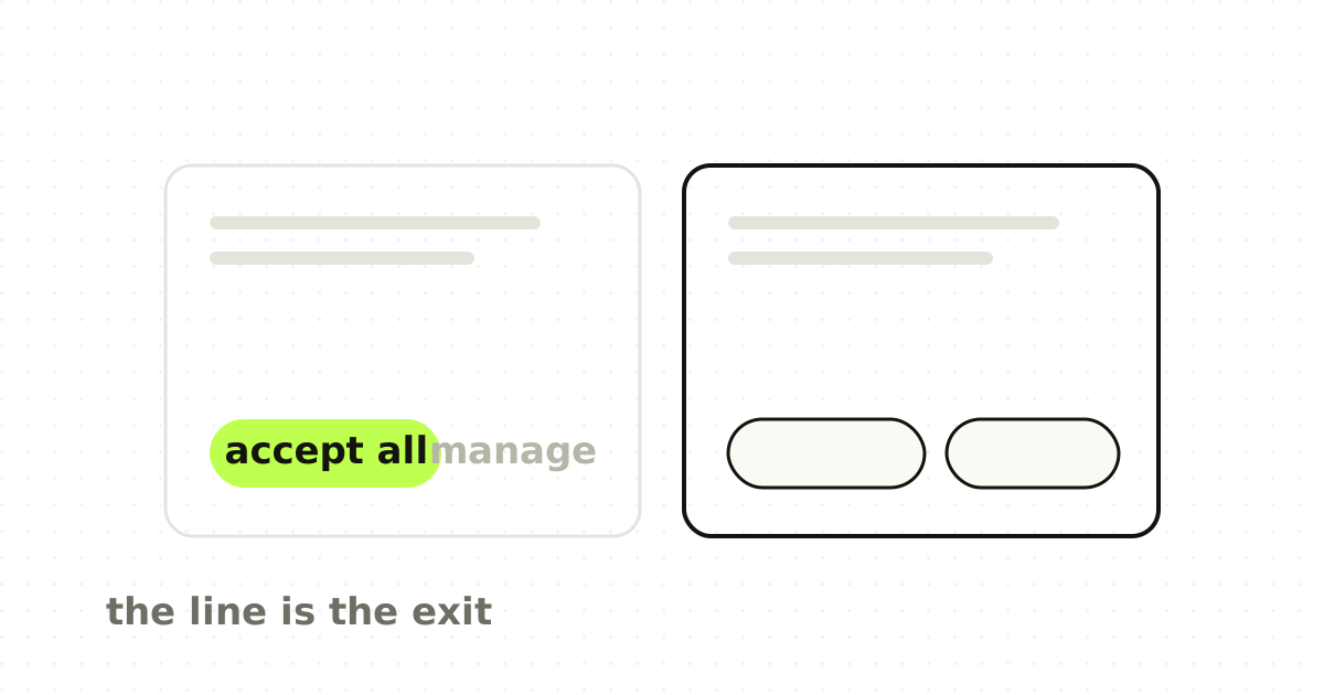
Accepting all cookies is one tap. Refusing them is a modal, four toggles, a save, and a dismiss. Both answers are available, so nobody has lied. The design has simply priced one of them out of reach, and the resulting consent number goes in a slide as though it measured a preference.
That asymmetry is the whole thing. Symmetry of choice is the property to test for: the answer the user wants should cost roughly what the answer you want costs.
Nobody has to be deceived for a design to be deceptive. It is enough that one answer was made expensive.
The named patterns are all the same move
Harry Brignull started cataloguing these in 2010 under the name dark patterns, now more often called deceptive design. The catalogue is long, but almost every entry is asymmetry wearing a different hat.
- Roach motel. Signing up is a form; cancelling is a phone call during business hours. 2. Confirmshaming. Declining requires clicking "No thanks, I don't want to save money", so the cheap answer carries a small social cost. 3. Sneaking. An item, a fee or a subscription renewal appears in the flow at a point where checking costs more attention than continuing. 4. Preselection. The box is already ticked, so the business outcome is the default and the user pays attention to escape it. 5. Obstruction. The unsubscribe link is real, four levels down, in a colour that passes contrast by a tenth of a point.
Read as a list of tricks, this is something to memorise. Read as one idea, it is something you can catch in your own work before anyone names it.
It stopped being only an ethics question
For most of the last decade this was an argument about values, which meant it lost to quarterly targets fairly often. That has changed.
The EU Digital Services Act prohibits interfaces that deceive or manipulate users, or that materially distort their ability to make free decisions, and it names asymmetric prominence and repeated nagging directly. Consent rules under the GDPR already required that withdrawing consent be as easy as giving it, which is the symmetry test written into law. Regulators in the United States have brought enforcement actions over sign-up and cancellation flows.
I am not going to pretend that a designer's conscience was ever the binding constraint. The useful development is that the asymmetry now has a cost attached, which means it can be argued about in the language the rest of the business already speaks.
Where the line genuinely is hard
Some cases are not close calls and some are. Honest ones I have argued about:
A free trial that requires a card. Not deceptive on its own, and it becomes deceptive the moment the reminder before the charge is quieter than the promotion that started it.
Urgency. "Three left in stock" is fine when three are left. The same string with a random number is fraud with a countdown timer on it.
Recommended plans. Marking one plan as recommended is helpful when it is the plan most customers should pick, and manipulative when it is the plan with the best margin. The pattern is identical from outside. Only the reason differs, which is why this one has to be decided by the team rather than caught in review.
Onboarding that asks for everything. Requesting notification permission at first launch is not a dark pattern, it is just weak design, and the fix is to ask when the value is visible rather than to argue about ethics.
What to actually do about it
- Put the two outcomes side by side in the review. Count taps for each. If the counts differ, say why out loud. 2. Write the decline path first. Teams design the happy path and retrofit the exit, which is precisely how asymmetry gets in without anyone choosing it. 3. Check the copy for shame. If the negative option carries an adjective, delete the adjective. 4. Set the default to what a well-informed user would pick, not to what the funnel wants. If those differ, you have found something worth escalating. 5. Measure the cancellation flow the way you measure sign-up. Nobody has a dashboard for how hard it is to leave, which is why nobody notices it getting harder.
The point
A dark pattern is not a category of trick you either use or avoid. It is a gradient your product slides down one reasonable-sounding decision at a time, because each individual decision was made to lift a number and nobody was looking at the accumulated cost of leaving.
The symmetry test is worth adopting because it survives a product manager. It is not about intent, which is unfalsifiable, and it is not about taste, which is arguable. It is about counting taps, and anyone in the room can do it.
Frequently asked questions
- What is a dark pattern in UX?
- A dark pattern, increasingly called deceptive design, is an interface choice that makes the outcome the business wants substantially easier than the outcome the user wants. The term was coined by Harry Brignull in 2010. It covers preselected boxes, hard-to-find cancellation, shaming copy on decline buttons, and consent dialogs where accepting takes one tap and refusing takes several.
- How do I tell a dark pattern from ordinary persuasion?
- Compare the cost of the two outcomes. Persuasion makes one option more appealing while leaving both equally easy to choose. Deception makes the option you do not want more expensive in taps, reading or time. If accepting is a button and declining is a settings screen, the design is deceptive whatever the intent behind it was.
- Are dark patterns illegal?
- In several jurisdictions, yes. The EU Digital Services Act prohibits interfaces that deceive or manipulate users, including asymmetric prominence and repeated nagging. GDPR consent rules require that withdrawing consent be as easy as giving it. Regulators in the United States have also brought enforcement actions over sign-up and cancellation flows.
- Is a preselected checkbox always a dark pattern?
- No. A default is only deceptive when it serves the business against the user's likely preference. Preselecting the option a well-informed user would choose anyway is good design and reduces effort. Preselecting marketing consent, paid add-ons or data sharing is deceptive, because the default is doing work the user would not have done themselves.
Sources
This thinking, applied
Share this