"I just see what looks good"
I came across a post from a developer recently that said, more or less: I don't use Figma, I design straight in code and see what looks good.
The first half did not bother me at all.
In 2026, designing directly in code is not a strange edge case. You can open a coding agent, describe an interface, connect it to an existing component library, run the product locally and start changing the real thing. Figma is moving the same way: it announced in May 2026 that Figma Make could work with a production codebase, and in June it put interactive code layers directly on the design canvas. Its framing is more interesting than the features. Teams should not have to pick one permanent starting point. Sometimes canvas is the right material, sometimes code is.
I agree. I started in the browser before moving deeper into product design, so I have never thought it an illegitimate place to design. Building the thing often exposes problems a static frame hides.
It was the second half of that post that interested me. I just see what looks good hides almost the entire job.
Because once AI can generate a polished interface for you, the bottleneck moves. The scarce skill is no longer producing the first reasonable screen. It is knowing whether that screen is actually good.
AI did not kill Figma. It broke the monopoly of the canvas.
The useful question is not whether designers should use Figma or code. That assumes product design has one correct surface, and it never did.
For years we bundled a large number of activities together and called all of them design. Research was design. Understanding the problem was design. Mapping a flow, deciding what belonged on a page, wireframing, drawing the interface, building components, prototyping, testing, reviewing what engineering shipped. Because so much of the visible work happened inside one tool, it became easy to confuse being fast in Figma with being strong at product design.
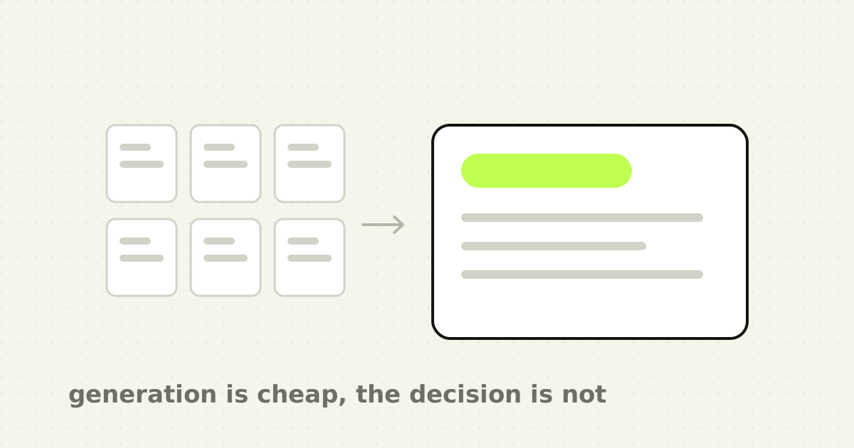
AI is separating those activities again. Producing a conventional card is cheap. Producing twenty versions of it is cheaper. Turning a written description into a React component is routine, and a respectable SaaS dashboard generated from a paragraph is no longer impressive on its own.
Knowing whether the dashboard should contain those six metrics is still a product problem. That did not get automated when the pixels did.
The hardest question was never "can we build this screen?"
Give an agent this prompt: create a modern B2B fintech dashboard showing revenue, invoices, payments, overdue accounts, recent activity and monthly performance.
You will get something decent. A sidebar, four metric cards, a line chart, probably a donut, recent activity, a table, status badges, reasonable spacing. Nothing embarrassing.
Now change the brief. The primary user is a bookkeeper. She opens the product for ten minutes each morning. She is not trying to understand the business. She needs to find payments that failed to match invoices, work out why, fix the exceptions and move on to the next client.
Suddenly that dashboard may be entirely wrong. Revenue may not deserve the first card. Monthly performance may not belong above the fold. The chart may not belong at all. The most important object on the screen might simply be 12 payments need your attention.
Same visual quality. Same technology. Completely different product.
The valuable question in AI-assisted design is not whether the model can create this. It is whether this should exist like this.
Polished interfaces make bad decisions harder to notice
Low-fidelity design had one genuinely useful property. It looked unfinished. A grey-box wireframe looked like a hypothesis, and nobody saw a rectangle labelled "chart" and assumed the product was ready.
Generated UI removes that warning. You type a prompt and shortly afterwards there is typography, spacing, icons, realistic data, responsive behaviour, transitions and something you can click. The interface looks far more mature than the thinking that produced it.
You can have a design that is eighty per cent polished while the product reasoning is twenty per cent complete. Visual confidence arrives before product confidence, and because the output looks finished, teams start discussing polish before agreeing what the screen is for. The prototype does not merely visualise the idea. It makes the idea feel more validated than it is.
This is not only a problem with AI tools. People are already more forgiving of attractive interfaces. Nielsen Norman Group calls this the aesthetic-usability effect: attractive interfaces are often perceived as easier to use, and visual appeal makes smaller usability problems easier to tolerate or miss entirely.
Now combine that bias with a machine that manufactures aesthetic plausibility in seconds.
A pricing page can look excellent while framing the plans badly. A dashboard can look sophisticated while making the primary task slower. An AI feature can look beautifully minimal while telling the user nothing about what it changed. A table can look clean because the generated sample data contains six perfect rows, and then the real product arrives with 4,800 records, missing fields, conflicting statuses, slow requests and a customer name 74 characters long.
The model did not necessarily fail. The review did. This is the same problem I hit writing about AI-generated imagery: synthetic output becomes convincing before it becomes trustworthy, and visual plausibility should make review more disciplined rather than less.
"Looks good" is not one judgment
When an experienced designer says something feels wrong, that can sound annoyingly subjective. Sometimes it is. More often it is compressed pattern recognition, and several distinct judgments are happening at once.
Does the hierarchy match the job? Where does the eye land first, and is that what the user needs first? If the most dominant object is a revenue chart while the user's job is resolving failed payments, the screen can be beautifully composed and still be answering the wrong question.
Does the interaction match the mental model? Users do not approach an interface from zero. They bring learned expectations for search, forms, tabs, settings, navigation, filters, tables and destructive actions. Research on first impressions has repeatedly found that visual complexity and prototypicality affect aesthetic judgment extremely quickly; in a Google-published study by Tuch and colleagues the effects appeared at exposures as short as 17 milliseconds, with simpler and more typical designs rating more strongly. That is not an argument for every product looking identical. It means familiarity has value, originality has a cost, and good design chooses where to spend it. I have written separately about where a SaaS product should look familiar and where it should not.
Is the complexity earning its place? Before anyone reads your carefully written copy, the interface has already told them how hard it will be to understand. AI will happily add another card. Judgment asks whether the card deserves to exist.
Does it survive real conditions? A static sample hides more than it reveals. What happens with no data, or too much of it? On a bad network? With read-only permission? When the API returns a partial result? At 375 pixels? With a keyboard? After the action fails? The happy path is a concept. The unhappy paths are the product.
Code-first design is genuinely better for some problems
I do not want this to become an argument for protecting a design tool because designers are comfortable in it. There are problems I would rather evaluate in working code.
Responsive behaviour is one. A desktop frame tells you what a composition looks like at one width and much less about what happens continuously between there and mobile. Complex interaction is another: keyboard navigation, focus management, loading states, optimistic updates, large tables, content overflow, drag and drop, streaming responses, agent progress, permission states. These are easier to understand when you can use them than when you draw a representation of them.
Figma itself is moving toward the combined workflow, including bringing production code into Make, putting interactive code layers on the canvas, and connecting work done in Claude Code back into editable designs. That is a more interesting future than either "designers must use Figma" or "Figma is dead". The boundary matters less. The quality of the decision matters more.
The decision that matters is when to stop generating
The workflow I find useful looks like this: problem, priorities, constraints, generate, inspect, stress-test, refine, systemise, validate, ship.
Notice that generating is one step. Demos emphasise it because it looks magical: prompt, loading indicator, working interface. The real work happens around it.
What problem are we solving, and who actually has it? What is the primary job? What deserves attention first, and what can be removed? Which constraints are real? What happens with no data, too much data, a failed request, an uncertain model? What requires human confirmation? What happens on mobile? Can an engineer maintain this? Is it using the real design system, or did the model invent another border radius, button treatment and spacing value? Can the user undo the action, and can they tell whether it completed?
Then generate again. That is a design process. "Make it prettier" is not.
Rejecting a weak answer requires knowing why it is weak
Microsoft Research defines appropriate reliance on generative AI as accepting correct output while rejecting incorrect output. Its 2024 synthesis reviewed around fifty papers and found that both over-reliance and under-reliance damage human-AI performance.
Consider what that means for a designer. To reject a weak answer you need enough understanding to recognise why it is weak.
If you do not understand information hierarchy, a generated hierarchy looks perfectly reasonable. If you do not understand accessibility, polished components hide inaccessible behaviour. If you do not understand research, a generated persona sounds authoritative while resting entirely on assumptions. If you do not understand frontend constraints, generated code works in the demo and becomes expensive to maintain.
AI lowers the cost of execution. Lower-cost execution makes evaluation harder, because weak work no longer announces itself by looking weak. Microsoft's earlier review of overreliance makes the same point from the other direction: human oversight only works when the human can recognise a wrong answer. That is not a small requirement. That is the skill, and it is why I think evaluation capacity, not generation capacity, is now the constraint.
Five questions before I trust a generated interface
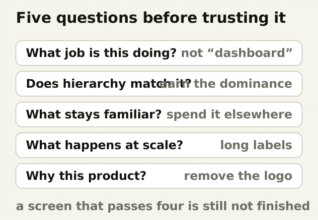
- What job is this screen actually doing? "Dashboard" is not a job. "Help a finance manager find reconciliation exceptions that need action" is. "Settings" is not a job. "Stop invoices going to the wrong billing email" is. If the job is vague, the generated interface fills the ambiguity with generic conventions, and generic conventions look surprisingly convincing. 2. Does the hierarchy match that job? The most visually dominant thing should earn its dominance. If the user needs to resolve a failed payment while the largest object is a revenue chart, the hierarchy is serving somebody else's goal. Visual hierarchy is often a business decision wearing a design costume. 3. What should stay familiar? Do not spend originality where familiarity removes effort. Spend it where it creates product or brand value. A date picker does not need a new interaction language. The way your system explains uncertainty might. 4. What happens when reality arrives? Test empty states, long labels, realistic volumes, slow and failed responses, partial permissions, destructive actions, mobile widths, keyboard use, screen-reader semantics, and undo. A generated happy path is an idea; a product begins when the unhappy paths arrive. This is also where internal confidence runs out, because internal review, QA and user research answer different questions. 5. Why does this belong to this product? Remove the logo and the name. Would the interface plausibly belong to twenty other SaaS products? That is not always a problem, since plenty of mechanics should be conventional, but the team should know the answer. Product character comes from repeated decisions: how dense the interface is, how it explains uncertainty, what is automated, what requires approval, how it words actions, how it behaves after errors, what it hides and what it reveals.
Judgment is not taste, and juniors still have to learn it
People increasingly say that as AI improves, taste becomes the moat. I agree with part of that and dislike the word, because it makes professional judgment sound mystical, as though experienced designers simply possess an unexplained instinct.
Most of what gets called taste can be unpacked. It is pattern recognition built through exposure. Understanding hierarchy. Recognising unnecessary complexity. Knowing which conventions users already carry. Restraint. Knowing what to remove. Seeing the edge case behind the perfect demo. Understanding the engineering cost of a clever interaction. Recognising when the business is solving its own internal problem rather than the user's. It is being able to say: this looks good, but it is wrong. Or: this looks ordinary, and ordinary is exactly what this part should be. When I wrote about how much work a default setting quietly does, the lesson was that small product decisions compound. AI makes those decisions faster to execute. It does not make them better.
That raises a problem the industry has not solved. How do new designers develop judgment when AI performs more of the execution? A lot of expertise develops through mistakes. You break the component, build a screen that is too dense, watch someone fail a usability test, design something beautiful that collapses on mobile, hand an interaction to engineering and discover it needs an absurd amount of state management. Do that enough times and some of it becomes instinct.
If a tool hands a junior designer a polished version immediately, they gain speed. The risk is losing the learning hidden inside the slower process. The answer is not avoiding AI, which would be like telling designers to resize frames manually because it builds character. The answer is making critique and reasoning first-class skills. Do not only teach people how to prompt. Teach them how to reject.
Instead of "make this better", ask what user decision this hierarchy is optimising for. Instead of "make it look premium", ask which visual decisions here are generic to B2B SaaS and which are specific to this product. Instead of "give me another design", ask what assumption this version makes about the user's priority. Instead of "make the dashboard simpler", ask which elements could be removed without reducing the user's ability to complete the primary job. Instead of "make it unique", ask which parts should stay conventional for usability and where differentiation would create real value.
That turns AI from a slot machine for polished screens into something closer to a collaborator. It also forces the human to keep thinking.
So can designers skip Figma?
Yes, sometimes, and that answer gets less controversial every month. You can start in a coding agent. You can prototype in Make. You can work directly in the browser with your existing component library. You can move a coded interaction back onto a canvas for critique. You can sketch on paper first.
Vibe coding will probably replace parts of what UI designers currently spend time on. There is less defensible value in mechanically producing obvious screens: turning a known wireframe into a conventional settings page, building routine card variations, applying a mature design system to predictable layouts. I do not want talented designers spending careers resizing nearly identical components if software can do it well. The opportunity is to move human effort upward, into problem framing, interaction strategy, information architecture, research, accessibility, design systems, differentiation, prioritisation and evaluation.
For a founder, none of this is really a debate about designer careers. It is a product-quality problem. Teams can now create more interface, faster, but quantity is rarely the bottleneck in a mature product. The bottleneck is deciding what not to add. If everybody can build faster, building the wrong thing faster becomes easier too.
The point
I do not much care whether the first version began in Figma, in a coding agent, in HTML or in a notebook. I care about what happens when the first version appears.
Can you explain why it works? Can you see what does not? Can you recognise what the model assumed? Can you tell which part should stay conventional and where the product deserves something distinctive? Can you stress-test it beyond perfect demo data? Can you explain the decision to a founder, another designer and an engineer? Can you change your mind when users prove you wrong?
AI has dramatically reduced the distance between an idea and an interface, and that is real progress. It also reveals something we forgot while arguing about tools. Generating the interface was never the hardest part. The hard part was deciding what deserved to exist, and it still is.
Frequently asked questions
- Can AI replace Figma for product designers?
- It can replace or shorten parts of a Figma workflow, particularly rapid prototyping, layout exploration, coded interaction testing and implementation. Figma is itself moving toward workflows spanning canvas and production code rather than treating them as separate worlds. What it does not replace is product reasoning, research, hierarchy, accessibility, validation or design-system work.
- What is vibe coding for designers?
- For product designers it generally means using AI coding agents and natural-language instructions to produce working interfaces rather than writing most of the code by hand. Its real design value is not avoiding engineering. It is being able to test genuine interactions, responsive behaviour, states and implementation constraints far earlier than a static canvas allows.
- Is it better to design directly in code?
- Sometimes. Code-first design is strongest when the problem depends on real interaction, responsive behaviour, data, loading, accessibility, keyboard behaviour or complex states. A canvas is still faster for broad visual exploration, collaborative critique, system work and comparing directions side by side. The strongest workflow uses both and treats the boundary as unimportant.
- Will AI replace UI designers?
- It is likely to automate more routine interface production. It does not remove the need to frame problems, prioritise information, design interactions, understand users, handle accessibility, build coherent systems and decide what should ship. The value of the role shifts away from operating a particular tool and toward product judgment that can be explained and defended.
- What skills should designers develop for AI-first workflows?
- Prioritise product reasoning, information architecture, interaction design, research, accessibility, design systems, frontend literacy, critique and evaluation. Learn prompting and AI coding tools, but treat them as production leverage rather than substitutes for understanding why an interface works. You cannot delegate a judgment you do not know how to make.
Sources
- Nielsen Norman Group, The Aesthetic-Usability Effect
- Microsoft Research, Appropriate reliance on Generative AI: research synthesis
- Microsoft Research, Overreliance on AI: literature review
- Tuch et al., Visual complexity and prototypicality in first impressions of websites, Google Research
- Figma, Figma Make, now on your local code
- Figma, Code on the Figma canvas
- Figma, The future of design is code and canvas
This thinking, applied
Share this