Why dashboard redesigns go wrong
A SaaS dashboard redesign usually starts with a complaint from someone new. A prospect in a demo could not tell what they were looking at, a new customer said the home screen was overwhelming, a board member asked why the product looked busy. The redesign is briefed to fix that first impression.
Then it ships, and the loudest reaction comes from a different group: the people who open the dashboard every morning. They had learned where everything was, and the redesign moved it. The first impression improved and the hundredth got worse.
Both groups matter, but they need different things. A new user needs orientation. A daily user needs speed, and speed comes from the learning a redesign is most likely to throw away. A good redesign serves the first without spending the second.
Start by watching the people who use it every day
Before sketching anything, sit with three or four people who open the dashboard daily and watch a real morning. Not a demo, not a survey. The most useful finding is almost always what they open alongside it: the spreadsheet, the second tab, the report they export because the dashboard does not answer the question.
That is where the brief changes. On Symantec CloudSOC, security analysts at Fortune 500 companies were losing 40 percent of their day to false-positive alerts. Twelve sessions with those analysts changed the direction of the redesign, which ended up rebuilt around how quickly an alert could be decided under pressure rather than how the console looked.
Write down each decision people make from the dashboard, how often they make it and what they open to make it. That list is the brief. Everything on the new dashboard has to answer to it.
Sort every element into keep, move or cut
With the decision list in hand, go through every tile, chart, table and filter on the current dashboard and give it one of three labels.
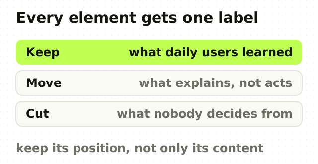
- Keep. Daily users rely on it and would notice immediately if it moved: the top-line numbers, the queue they work through, the filters they set every day. Keep its position as well as its content.
- Move. It explains something, such as a trend, a breakdown or a comparison, but nobody acts on it directly. It belongs a click deeper, next to the thing it explains.
- Cut. Nobody can name a decision it supports. It was added because someone asked, and it stayed because nobody could prove it was unused. Check the analytics, then remove it.
Most dashboards come out of this exercise with a short keep list, a long move list and a cut list that makes someone uncomfortable. That discomfort is the redesign working.
What power users lose in a redesign
The things daily users depend on are rarely the things that appear in a redesign brief. Before changing anything, inventory these:
- Density. Experts often want more rows on screen, not more whitespace. A roomier layout can halve how much an analyst sees at once.
- Column order, sort order and saved filters. These are hours of personal configuration, and a redesign that resets them feels like it deleted work.
- Keyboard shortcuts and tab order, which are invisible in a mockup and central to anyone who processes a queue.
- Deep links and bookmarks. People share URLs to filtered views in chat and tickets. Break the URL scheme and you break every one of them.
- Position. People find things by where they were. Moving a well-used control is costlier than restyling it.
None of this means nothing can change. It means each of these gets changed on purpose, with a migration, rather than as a side effect.
Restructure around exceptions and actions
The structural change that helps both groups is the one argued in your dashboard doesn't need another chart: separate the situation, the explanation and the action, and give exceptions more space than averages. A new user gets a clear answer to "is anything wrong?". A daily user gets a shorter path from that answer to the records that need attention.
Nielsen Norman Group's guidance on dashboards points the same way. A dashboard is for information that can be taken in at a glance with minimal interaction, not for open-ended exploration, and it should use encodings people read fastest, such as length and position, over ones that need decoding.
Severity needs the same care. If red and amber carry the difference between "look now" and "look later", check it survives colour blindness and a poor monitor, because contrast ratios are a floor, not a target.
Roll it out without a revolt
How a redesign is released decides much of how it is received. Aaron Sedley's account of change aversion at Google argues that people react less to change itself than to change handled badly: no warning, no explanation, no way back. Google also published a short paper on applying the same thinking to the launch of Google Drive, which is a useful model for a product people depend on at work.

For a B2B dashboard, that translates into a few rules. Announce it in the product before it ships, with a short note on what moved and why. Offer the new version as opt-in to a small group of accounts first, ideally including your heaviest users. Keep the old view reachable for a few weeks where the engineering allows it. And read what that first group does, not only what they say.
Measure the redesign against decisions
A dashboard redesign should be judged on whether people decide faster and better, not on whether they like the look.
Pick two or three measures before launch. Time from opening the dashboard to the first action. The share of sessions that go from the dashboard to a record or a queue, rather than ending there. Support tickets about finding things. Exports to spreadsheets, which often mean the dashboard is not answering the question. Compare them before and after, for the pilot group and for everyone.
The point
A dashboard redesign fails when it treats the product as a first impression. The people who pay for it are the ones who open it every day, and their speed is the asset a redesign is most likely to spend by accident.
Start from their decisions, keep what they have learned, move what only explains and cut what nobody uses. The new user gets a clearer screen and the daily user loses nothing they relied on. That is the redesign worth paying for.
Frequently asked questions
- How do you redesign a SaaS dashboard?
- Start by watching daily users and listing the decisions they make from the dashboard, how often and with what evidence. Sort every existing element into keep, move or cut against that list. Restructure around exceptions and actions rather than charts, preserve saved views, shortcuts and column orders, release to a small group first, and measure time to a decision before and after.
- What makes a good SaaS dashboard?
- A good SaaS dashboard answers the questions its users open it to ask, quickly and with a clear next step. It shows the current situation at a glance, puts explanation such as trends and breakdowns one level deeper, and links every exception to the records that need attention. It is judged by decisions made, not by how many metrics are visible.
- How do you get users to accept a redesigned dashboard?
- Announce the change before it ships and explain what moved and why. Offer the redesign as opt-in to a small group of accounts first, including heavy users, and keep the old view reachable for a transition period. Preserve personal configuration such as saved filters and column orders, and follow up with the pilot group before the full release.
- How long does a dashboard redesign take?
- A SaaS dashboard redesign typically takes four to eight weeks of design work, driven mainly by how many distinct roles use the dashboard rather than by screen count. Two roles with different permissions is a bigger job than forty screens for one role. An existing list of the decisions the dashboard supports shortens the timeline noticeably.
- Should a SaaS dashboard be customisable?
- Customisation helps daily users who make different decisions from the same product, but it is not a substitute for good defaults. Many people never change the default layout, so the default has to serve the most common role well. Offer saved views and column settings before offering a fully configurable canvas, which is costly to build and hard to support.
Sources
This thinking, applied
Share this