The brief I keep hearing is internally contradictory
Make it intuitive. Make it unique.
Both requests are reasonable. They pull in different directions. Intuitive interfaces borrow mental models users already have. Unique interfaces introduce something less familiar. If a team treats both as universal requirements for every part of the product, design becomes a fight between novelty and usability.
The way out is to stop asking whether the product should be familiar or distinctive as a whole, and start asking where each quality belongs.
Familiarity is compressed learning
Jakob's law is usually paraphrased as: users spend most of their time on other products. The practical implication is that every convention you follow is knowledge the user does not have to acquire again.
Nielsen Norman Group's consistency and standards heuristic makes the same point more formally. People should not have to wonder whether different words, situations or actions mean the same thing.
That matters more in B2B software than in consumer experiences, because the interface is rarely the user's entertainment. It is a tool inside a job. A finance operator matching payments does not want to discover your artistic interpretation of a checkbox. An analyst should not have to learn that your spark icon means filters.
Every unnecessary novelty taxes the task.
Familiarity can also become camouflage
There is a second failure mode. A product built entirely from correct patterns, with no identity beyond its logo.
The sidebar is standard. The dashboard is standard. The empty state is standard. The copy sounds like every competitor. The illustrations could be swapped with a stock pack. The product is easy to use on day one and impossible to remember on day two.
Teams usually overcorrect here. They redesign navigation, invent custom controls, animate everything, or hide basic actions behind branded metaphors. The intention is differentiation. The result is friction.
Keep the mechanics familiar. Make the meaning distinctive.
A map for deciding what stays conventional
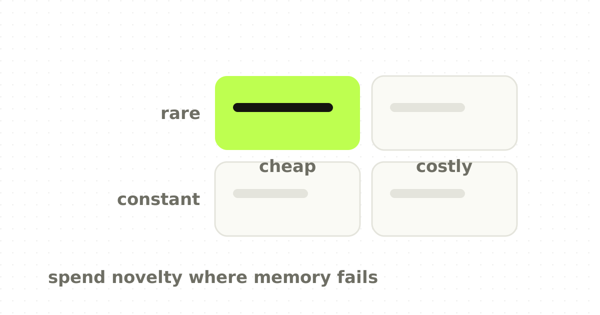
Two questions decide it. How often does the user perform this action, and how costly is a misunderstanding?
The more frequent and consequential, the stronger the case for convention.
- High frequency, high cost. Save, submit, cancel, destructive actions, filters, sorting, table selection, date pickers, billing, authentication, permissions, export, status changes with operational consequences. This is not the place to prove the brand is creative. 2. High frequency, low cost. Search, empty states, keyboard shortcuts, loading and lightweight feedback can carry tone, motion and copy personality without making the interaction harder. 3. Low frequency, high cost. First-time integrations, permission setup, migration, automation rules, AI actions, account deletion. Rare but risky, so explicit explanation matters more than visual convention alone. 4. Low frequency, low cost. Celebration moments, report reveals, branded illustration, onboarding transitions, shareable artefacts, editorial surfaces. This is the playground.
The originality budget is finite
A user can absorb only so much novelty before the whole product feels unpredictable. Treat originality as a budget and spend it where the return is largest: a hero interaction that explains the core mechanism, a memorable visualisation unique to the product, a distinctive content system, a branded completion moment, a signature motion pattern, a narrative way of framing results.
Do not spend it on a custom dropdown unless the dropdown is the product.
This is why many well-designed enterprise products feel conservative in controls and expressive in framing. They know where users need confidence and where the brand can speak.
First impressions reward the familiar more than designers like
The Google-published research by Tuch and colleagues is uncomfortable for anyone who equates novelty with quality. Across experiments, websites with lower visual complexity and higher prototypicality were judged more attractive, with effects appearing after extremely short exposures.
That is not an argument for generic work. It means the brain rewards processing fluency. A user who can parse a page quickly experiences less friction before consciously evaluating anything.
The best distinctive work often hides inside that fluency. You recognise the structure immediately, then notice that the story, rhythm and art direction could only belong to that company.
Convention, system, signature
A practical way to design the balance is to separate the product into three layers.
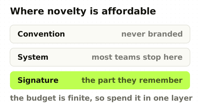
- Convention. External standards. Buttons behave like buttons, tables like tables, navigation like the category. Accessibility is never branded. 2. System. Internal consistency: spacing, type, states, component behaviour, tokens that name a decision rather than a value, density and layout rules. This makes the product feel coherent. 3. Signature. A small set of distinctive decisions a user can remember. A characteristic way of showing confidence in a match, a specific treatment for AI actions, a recognisable motion language, a branded data-story pattern.
Most design systems are strong at layer two. Many teams forget layer three. Others force layer three into layer one and create usability problems.
Where enterprise products can safely be distinctive
Data interpretation is the strongest candidate. Do not only show metrics; give the product a characteristic way of explaining what changed, what matters and what to do next.
AI states are the second. A generic sparkle icon has become close to meaningless, and a product-specific vocabulary for confidence, review, automation and human override is both clearer and more ownable than borrowing the category default.
Empty and success states are low-risk moments where tone and illustration build memory without touching a critical path. Marketing pages can be visually distinctive while the in-product control stays familiar: show the mechanism in a branded way, and let the user operate it conventionally.
A convention-breaking test
Before changing a familiar pattern, answer five questions.
- What user problem does the conventional pattern fail to solve? 2. Is the proposed novelty faster or clearer in a task test? 3. What prior knowledge does the user lose? 4. What is the recovery cost when they guess wrong? 5. Is the uniqueness visible in screenshots but annoying in daily use?
If the only answer is that it feels more premium, keep the convention and move the premium expression somewhere safer.
The point
Good SaaS design is not a contest between boring usability and creative identity. It is an allocation problem.
Familiarity should carry the interactions users need to trust immediately. Distinctiveness should carry the ideas you want them to remember.
The strongest products do both so cleanly that users never notice the separation. The interface feels obvious, and the product still feels like itself.
Frequently asked questions
- What is Jakob's law in UX design?
- Jakob's law observes that users spend most of their time in other products, so they expect yours to work the way those do. The practical implication is that following an established convention is knowledge the user does not have to learn again, which lowers the cost of adopting your product, particularly in software people use to do a job.
- Should a SaaS product look different from its competitors?
- In some places, yes. Keep high-frequency, high-consequence mechanics conventional, because unfamiliar controls in daily work create friction and risk. Spend distinctiveness on the product story, hierarchy, data interpretation, motion and a few signature moments, where a memorable choice builds recall without making any task harder to complete.
- Where should SaaS products follow design conventions?
- Wherever the action is frequent and a misunderstanding is costly: save and cancel, destructive actions, filtering and sorting, table selection, date pickers, billing, authentication, permissions, export, and status changes with operational consequences. These are the places where a novel pattern costs the user time and confidence for no gain.
- What is an originality budget in product design?
- The idea that users can absorb only so much novelty before a product feels unpredictable, so distinctiveness should be spent deliberately rather than everywhere. Concentrate it on moments that build memory, such as how you demonstrate the core mechanism or present results, and leave the routine controls conventional.
Sources
This thinking, applied
Share this