The founder knows too much
One of the hardest people to design a homepage for is the person who built the company.
They know every use case, the roadmap, why a small-looking feature took six months of infrastructure work, and why the product is not really like the competitor the market keeps comparing it to.
Then they try to put all of that in the hero.
The result is a headline with three ideas, a subhead with five, two competing buttons, four badges, a screenshot, a floating animation, and a sentence explaining the sentence. Nothing is technically missing. Understanding is missing.
Ten seconds is not a metaphor
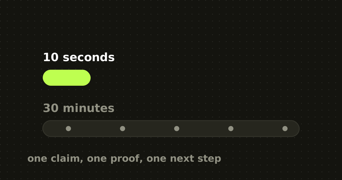
Nielsen Norman Group's analysis of page visits found users are especially likely to leave in the first ten seconds. Pages that communicate a clear value proposition can hold attention longer, but the early judgment is harsh.
Separately, the Tuch research published through Google Research found people form aesthetic judgments after extremely short exposures, influenced by visual complexity and prototypicality.
Those studies measure different things. Together they describe a cold homepage visit: people decide quickly whether the page is worth more cognition.
A sales call is the opposite environment. The buyer has already agreed to spend time. The seller can diagnose context, change examples, answer objections and expand as relevance becomes clear.
The homepage cannot adapt. It has to compress. The call can adapt, so it can afford depth.
What the first viewport actually owes a visitor
For most B2B SaaS homepages I want the first viewport to answer five things without making the reader decode the product.
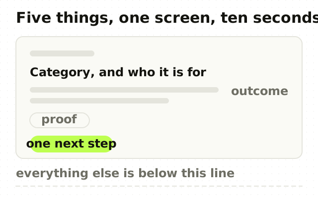
- What category am I looking at? Give enough context to create a shelf in the mind. Inventing an entirely new category in the first sentence adds work unless category creation is the strategy. 2. Who is this for? The buyer should recognise themselves. For finance teams closing multi-entity books beats for modern businesses. 3. What painful outcome changes? Translate capability into consequence. Faster close. Fewer reconciliation exceptions. Shorter time to an answer. 4. Why should I believe you? One proof signal is often enough: a named customer, a credible metric, an integration, a security standard, a recognisable workflow. 5. What is the next step? One primary action. Secondary paths can exist, but the hierarchy should be obvious.
That is already a lot for a hero.
What moves below the fold
Founders resist removing content because every removed line feels like lost persuasion. But the page is not a bucket, it is a sequence.
Move secondary use cases, architecture detail, long feature inventories, edge-case objections, integration catalogues, category education, long testimonials, detailed return-on-investment explanation, implementation process and enterprise controls deeper into the page. The visitor who reaches those has already paid with attention. Now you can give them more.
Order the page by doubt, not by convention
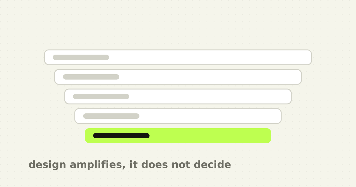
A useful structure is not hero, features, testimonials, call to action by default. It should follow the order of scepticism.
For a complex SaaS buyer the questions run roughly: is this relevant to me, does it solve the painful part, is it different from what I already use, is it real and credible, will it work in my environment, what does adoption involve, and what should I do next.
Build the page around those and the section order becomes defensible rather than habitual.
One dominant reading path is not exclusion
A common objection to a focused homepage is that the company serves three segments.
You can still serve them. The homepage needs a dominant reading path, and secondary buyers can branch through navigation, use-case cards or industry pages. Trying to make every segment feel equally primary in the hero produces language so abstract that nobody feels specifically understood.
A focused homepage is not refusing revenue. It is choosing the first story.
Sales transcripts beat the founder's memory
If you are rewriting a homepage, read recent sales calls before touching the hero. Look for the sentence prospects repeat back, the moment they finally understand, the objections that appear in nearly every call, the competitors they raise unprompted, the words they use for the problem, and the proof that changes their level of interest.
Then ask which of those signals deserves to appear before the meeting. That is how a homepage becomes a compressed version of a working sales story rather than a compressed version of the product database. It is also why a redesign brief should start after the positioning is settled, not before.
Two buttons is usually one too many
The other habit that costs a hero its clarity is offering a choice before the visitor has a reason to make one. Book a demo beside Start free trial beside Talk to sales asks someone who does not yet know what the product is to decide how they want to buy it.
A visitor who is still deciding whether the page is relevant cannot rank three commitments. Faced with that, most people pick neither, because doing nothing is the cheapest option available and nothing on the page has yet made it expensive.
Pick the action that suits the buyer you named in the hero, make it the only one with visual weight, and let the secondary route exist as a text link for the minority who arrived already convinced. The exception is a genuine self-serve and sales-led split, where two motions really do exist, and even then one of them is usually the majority path and should look like it.
The ten-second test
Do this with someone outside the company. Show the homepage for ten seconds, then hide it. Ask them to describe what the company sells, who it is for, what result it promises and what they remember visually.
Do not correct them while they answer. Their wrong answer is the page you actually shipped.
Repeat it after each major direction. It is not a substitute for research, and it is excellent at catching self-inflicted complexity.
The point
A homepage is not a salesperson trapped in a browser. It cannot listen, diagnose or adapt in real time. Its advantage is different: it can make a clear promise instantly, show proof at the right moment, and route the right visitor into a deeper conversation.
The job is not to tell the whole story. It is to make the next ten seconds worth giving you.
Frequently asked questions
- How much information should a SaaS homepage hero contain?
- Enough to answer five things: what category the product belongs to, who it is for, what painful outcome changes, one reason to believe it, and what to do next. Everything else, including secondary use cases, architecture detail and long feature lists, belongs deeper in the page where a visitor has already spent attention to reach it.
- How long do visitors spend on a homepage before leaving?
- Nielsen Norman Group's analysis of page visits found that users are especially likely to leave within the first ten seconds, and that pages communicating a clear value proposition hold attention longer. Separate research found aesthetic judgments form after exposures measured in milliseconds, so both the message and the visual impression are decided very quickly.
- Should a homepage target one customer segment or several?
- Give one segment a dominant reading path, and route the others through navigation, use-case pages or industry pages. Attempting to make several segments feel equally primary in the hero forces language abstract enough that none of them feels specifically understood, which is usually worse for total conversion than choosing a first story.
- How do I write homepage copy that actually converts?
- Start from recent sales calls rather than the product roadmap. Look for the sentence prospects repeat back, the objections that appear in nearly every call, the words they use for the problem, and the proof that changes their interest. Then decide which of those signals deserves to appear before the meeting happens.
Sources
This thinking, applied
Share this