I can usually name the category before I read the logo
You have seen the page. Near-black background. Violet-to-blue gradient. A small pill above the headline. Sixty-pixel sans-serif type. A floating product screen in a glass card. A bento grid halfway down. One abstract 3D object to signal AI. Grayscale logos. Built for modern teams.
None of those decisions is wrong. Together they have become a uniform.
The interesting part is that most teams did not copy one another on purpose. They copied the same references, used the same component libraries, asked the same models for inspiration, and optimised for the same short-term signal: look credible enough to belong to the category.
Category credibility is useful. Category invisibility is not.
Sameness is a rational local decision
If you are launching in six weeks, borrowing patterns from the respected products in your space is sensible. Those sites have been tested in market, your team knows how to build the patterns, and buyers recognise the vocabulary.
Now repeat that decision across three thousand startups. The local decision stays rational. The category outcome becomes monotonous.
Generative tools strengthen the effect because they are optimisation machines for the centre of a distribution. Ask for a premium B2B AI SaaS homepage and the model is statistically rewarded for producing something recognisably premium, recognisably B2B, recognisably AI and recognisably SaaS. The output converges on the shared visual grammar of those labels.
Creativity research offers a useful analogue. In experiments published in Nature Human Behaviour, people using ChatGPT often produced stronger individual ideas while the pooled set became less diverse. The technology can raise average quality and reduce variety at the same time.
That is close to a description of the current landing-page market.
Familiarity is not the enemy
There is a lazy critique of SaaS design that treats every convention as creative failure. I do not buy it.
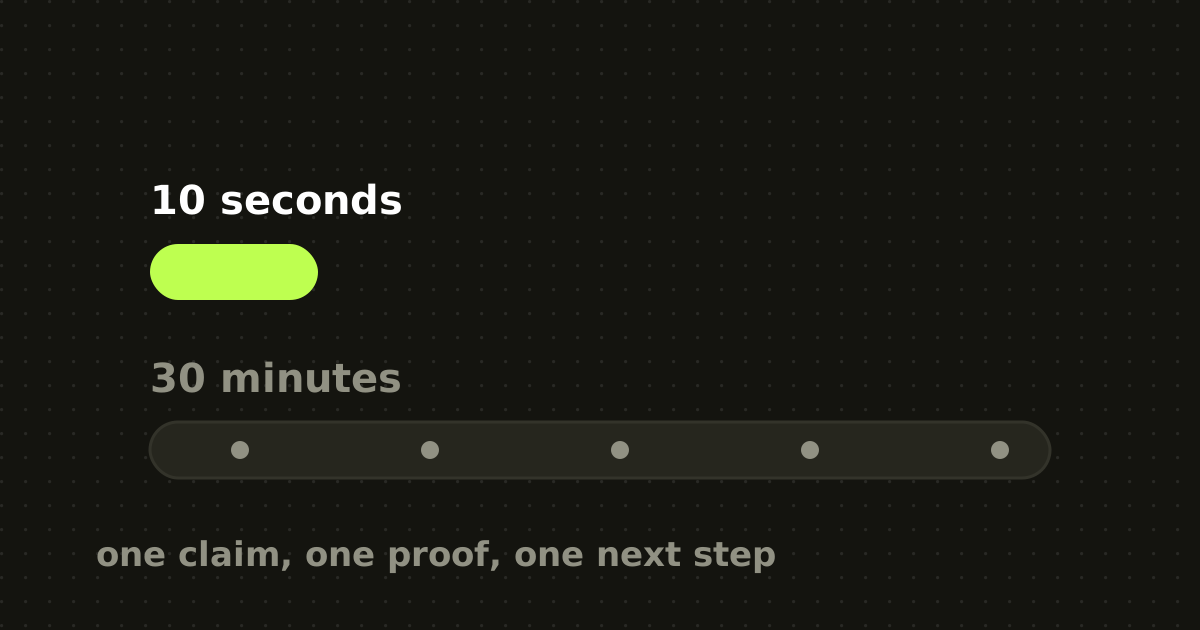
Google research on first impressions found that people respond strongly to visual complexity and prototypicality, and that those judgments form in milliseconds. Simpler sites that look like what a visitor expects of that kind of site tend to be judged more positively.
A pricing page should still look like a pricing page. A button should still look clickable. Navigation should not become a puzzle because the brand team wanted to break the grid.
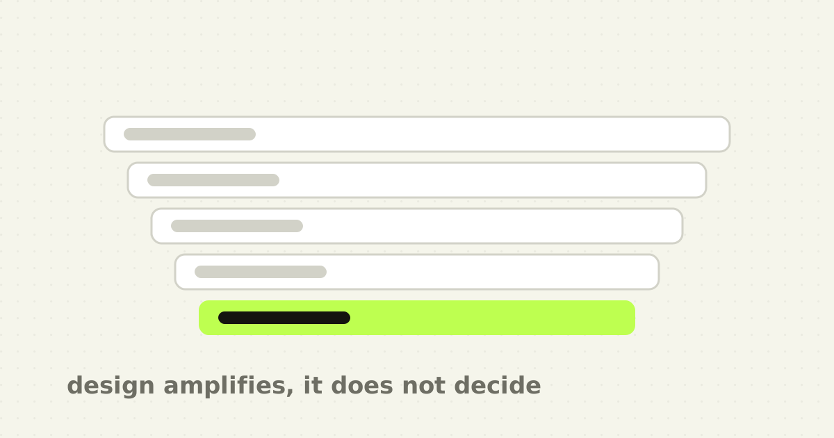
The problem is not using conventions. It is allocating your entire identity budget to them.
If the header, hero, demo, proof, section order, cards, illustration style, motion and copy rhythm are all borrowed from the category, a visitor has nothing left to remember.
Five forces pushing every site to the same centre
- Benchmark gravity. Moodboards start with the same four companies, and the references quietly become the brief: like one but warmer, like another with less copy. 2. Component gravity. Modern libraries are excellent and they make one class of layout extremely cheap. A card grid built from default spacing, radius and type tokens will look like every other product built from the same ingredients. 3. Model gravity. Generative tools predict plausible continuations, and plausible often means familiar. Without strong context, meaning tokens, art direction, examples and explicit anti-patterns, a model fills gaps with the median of its training distribution. 4. Stakeholder gravity. Make it look like a serious SaaS company is a request for risk reduction, and the fastest way to satisfy it is to resemble companies already accepted as serious. Credibility borrowed this way has diminishing returns once everyone uses the same cues. 5. Shipping gravity. Distinctive art direction requires decisions, and decisions take time. A bento grid can be populated before the positioning meeting ends, which makes visual convention a convenient hiding place for an unfinished story.
Differentiate the meaning, not the mechanics
Mechanics are how a visitor operates the site. Meaning is why this company should exist instead of the ten tabs beside it.
Keep the mechanics conventional where convention lowers effort: navigation, buttons, forms, pricing selection, comparison tables, account creation. Spend originality where it changes memory or comprehension.
Your core mechanism deserves most of it. Show the thing your product does that competitors cannot honestly claim, and show the transformation rather than another angled screenshot. If the product reconciles payments, show the reconciliation logic. If it automates support, show the handoff between agent and human.
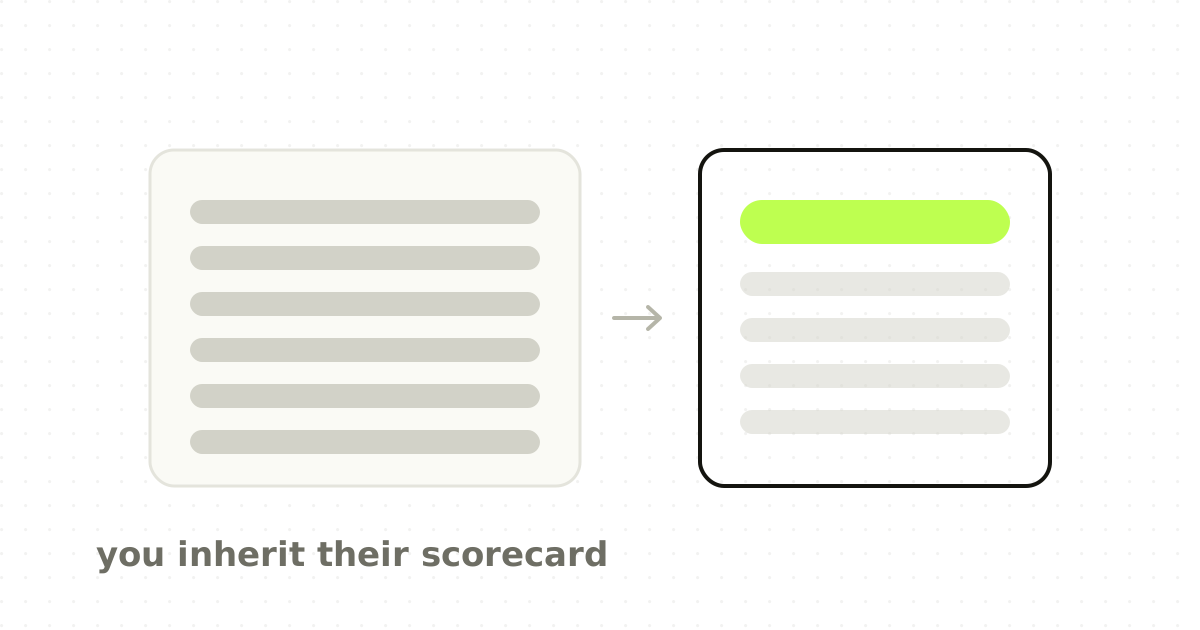
Your proof architecture is next. Most sites use the same logo row because it is easy. Stronger proof is specific: a before-and-after workflow, time saved in a named task, a quote sitting next to the screen it refers to, evidence arranged in the order a buyer evaluates it.
Then your editorial voice. A useful point of view is harder to copy than a gradient, and a falsifiable claim about your category tells a reader how you see the problem.
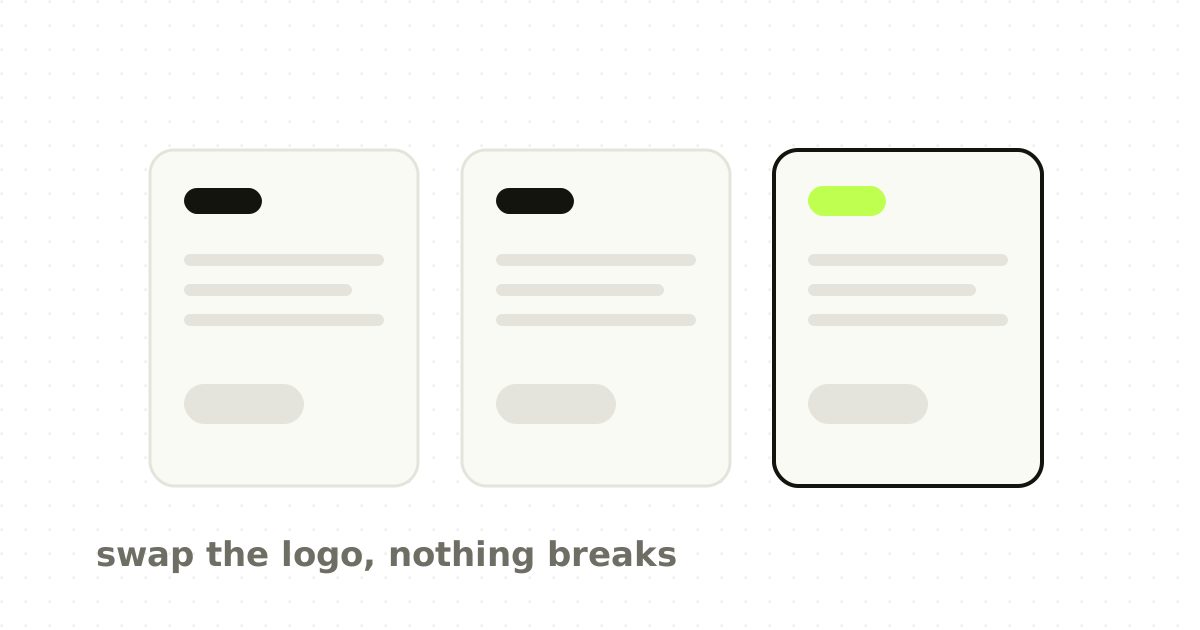
Finally your visual grammar, which is not a palette. It is a repeatable relationship between type, spacing, imagery, motion, data and composition. A competitor should not be able to paste their logo into it without the mismatch becoming obvious.
The anti-template test
Before approving a homepage, run this.
- Remove the logo and company name. 2. Replace the product screenshot with a grey box. 3. Read only the hero, section headings, proof and call to action. 4. Ask whether a direct competitor could publish this tomorrow with fewer than ten word changes. 5. Now reverse it. Hide the words and look only at the visual system. Could the same competitor wear it convincingly?
If the answer is yes in both directions, the site is category-correct and company-weak. That can still convert warm traffic. It will struggle to build memory.
Do not chase uniqueness as a target
There is no medal for the strangest website in your category. Originality can reduce comprehension, unfamiliar interaction patterns can make an expensive product feel risky, and an identity can get loud enough that the interface performs for designers instead of explaining the product to buyers. The same trade-off decides where a SaaS product should look familiar and where it should not.
The goal is recognisable category, specific company. A good B2B site lets a visitor answer two questions quickly: what kind of product is this, and why is this one different. The first benefits from familiarity. The second requires specificity.
The point
AI did not invent design sameness. Templates, benchmarks, design systems and trend cycles were doing that already. AI makes the centre cheaper to reach.
That creates a choice. Use the speed to produce more of the same, or use it to spend less time on scaffolding and more on the product-specific decisions that create memory.
The strange thing about this era is that the easiest way to look AI-generated is not to use AI. It is to make the same unexamined choices as everybody else.
Frequently asked questions
- Why do AI startup websites all look alike?
- Because the incentives converge. Teams benchmark the same admired companies, component libraries make one class of layout very cheap to build, generative tools are rewarded for producing familiar output, and stakeholders ask for designs that look like companies already accepted as credible. Each decision is locally sensible, and the aggregate result across thousands of startups is a uniform.
- Is it bad for a SaaS website to follow design conventions?
- No. Research on first impressions finds that visually simpler, more prototypical sites are judged more positively, and those judgments form in milliseconds. Conventions in navigation, forms and pricing reduce the effort of using a site. The problem is spending your entire identity budget on conventions, which leaves a visitor nothing specific to remember.
- How do I make my SaaS website more distinctive?
- Differentiate meaning rather than mechanics. Keep controls conventional, then spend originality on your core product mechanism, your proof, your editorial point of view and a visual grammar that a competitor could not wear convincingly. Showing the transformation your product performs beats another angled screenshot of the interface.
- What is the anti-template test for a homepage?
- Remove the logo, grey out the product screenshot, and read only the hero, headings, proof and call to action. If a direct competitor could publish the same page with fewer than ten word changes, the message is generic. Then hide the words and check whether the same competitor could wear the visual system. Failing both means the site is category-correct but company-weak.
Sources
- Meincke, Nave and Terwiesch, ChatGPT decreases idea diversity in brainstorming, Nature Human Behaviour
- Lee and Chung, An empirical investigation of the impact of ChatGPT on creativity, Nature Human Behaviour
- Tuch et al., Visual complexity and prototypicality in first impressions of websites, Google Research
This thinking, applied
Share this