SaaS strategy
The decisions that sit above the interface and constrain all of it: who the product is for, what it replaces, and what a buyer has to believe before the design can do any work at all.
What this covers
A redesign amplifies whatever a company has already decided. If the decision is unclear, a better-looking site makes the unclarity louder and more expensive. Every post here is about a decision that sits above the interface, where design cannot reach it.
Start with the diagnostic. Score a site across positioning, message, proof, conversion path and system velocity, and only the last two are design problems. If three people in the company describe three different products, the problem is upstream of anything a designer can fix, and the fix is a positioning package rather than a mood board.
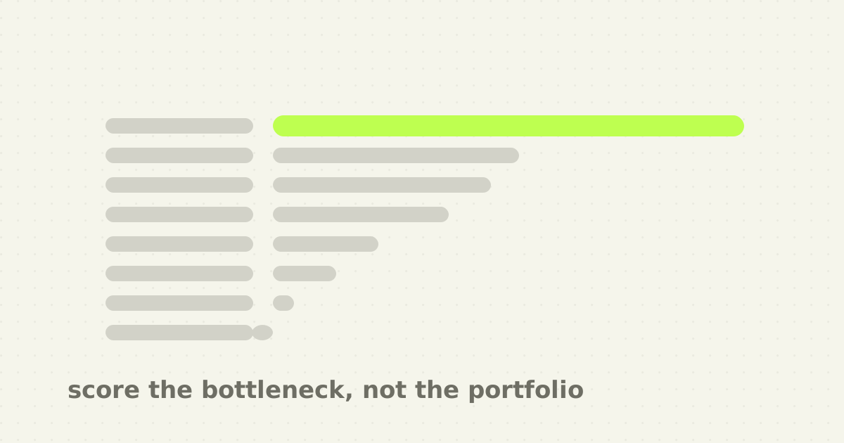
From there the posts split by decision. Whether to name a competitor at all is a choice of evaluation frame, not a measure of boldness, and borrowing an incumbent's frame means inheriting their scorecard. What a homepage owes a visitor in ten seconds is a compression problem, because a page cannot ask a question back the way a sales call can. Why AI startup sites became interchangeable is what happens when every team benchmarks the same three competitors. And choosing who builds the thing is a matter of scoring the bottleneck rather than the portfolio, since a portfolio shows what an agency can make look good, not what your team inherits after launch.
None of this is marketing advice wearing a design hat. It is the part of the work that decides whether the design has anything true to say.
Start with Your SaaS website probably doesn't need a redesign yet. It is the diagnostic the others assume. Five layers, and only the bottom two are design problems.
How to choose a B2B software website design agency
A portfolio tells you what an agency can make look good. Your selection process has to reveal how they think and what they leave behind.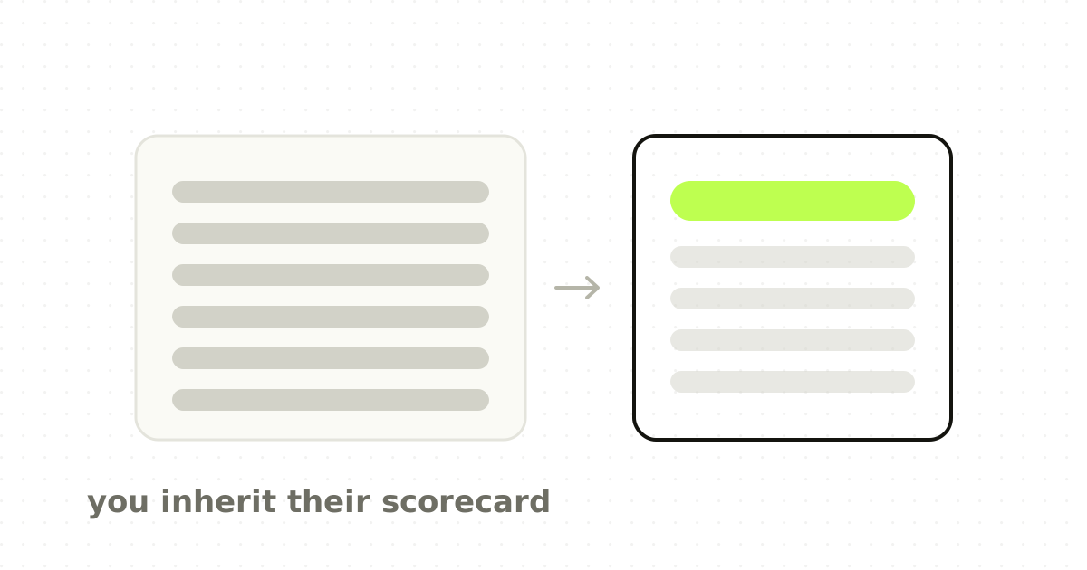
Red zone messaging: when to position against the incumbent
A challenger does not earn attention by pretending the incumbent does not exist. But naming the leader tells the buyer exactly which comparison to make.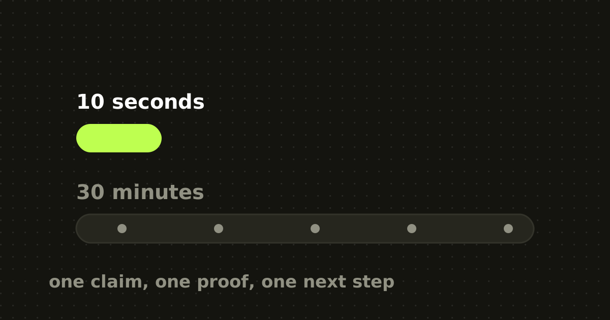
Your homepage has 10 seconds. Your sales call has 30 minutes.
One surface compresses and the other adapts. Designing them with the same amount of information ignores the attention contract.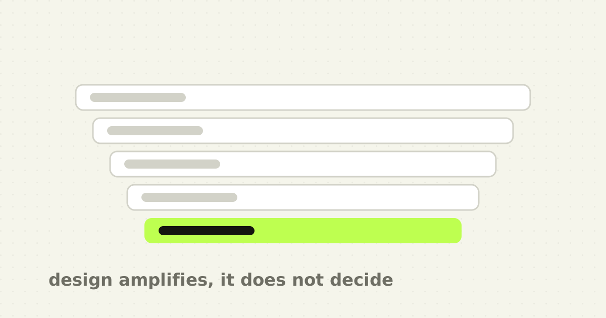
Your SaaS website probably doesn't need a redesign yet
A redesign is an amplifier. If the story is sharp it makes it faster to understand. If the positioning is vague, it makes the vagueness more polished.