The advice that dies on contact with enterprise software
Every design review reaches the moment where someone says the screen has too many options and cites Hick's law. It sounds authoritative. It is usually the wrong reading, and in enterprise software it is an argument that cannot be acted on.
A security analyst's triage view has forty controls because the job has forty controls. A billing admin screen has every field it has because finance asked for each one and can name the audit that produced it. You cannot delete your way out of that. Told to apply Hick's law, a team either ignores the advice or hides real functionality behind a menu and calls it simplification.
The law is genuinely useful. It just does not say what the design-review version says.
What Hick actually measured
In 1952 William Hick ran a reaction-time experiment. Participants faced a set of lamps, each paired with a key, and pressed the matching key when a lamp lit. The finding was that reaction time grew with the logarithm of the number of alternatives, not in proportion to it. Ray Hyman published a closely related result the following year.
Two details in that setup matter more than the equation. The alternatives were equally likely, and the participants already knew what every one of them meant.
That is a narrow situation. It describes a person choosing among options they have already learned, where nothing about the set favours one answer. Almost nothing on a real screen looks like that.
Logarithmic growth is the good news in the law, and it is the part that gets dropped. Doubling the options does not double the decision.
The logarithm is the point everyone skips
If decision time rose linearly with option count, deleting options would be the only lever, and the design-review reading would be right. It does not. Going from four options to eight adds far less than the first four cost.
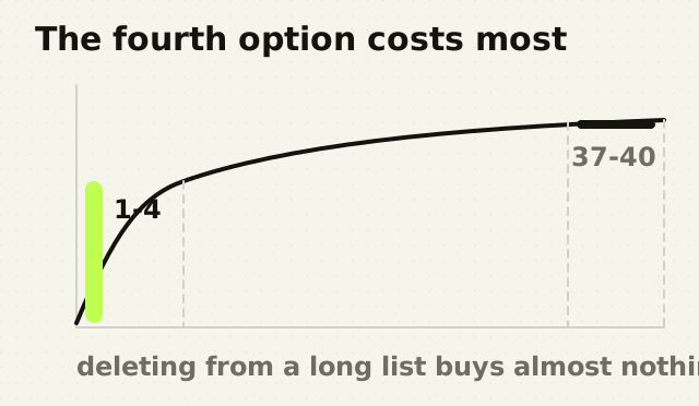
Which means the return on deleting an option is small, and it drops as the list gets longer. Removing three items from a list of forty buys almost nothing measurable, while costing a real user the thing you removed. The maths that gets cited to justify deletion is the same maths that says deletion is a poor trade.
Grouping is the lever the law actually hands you
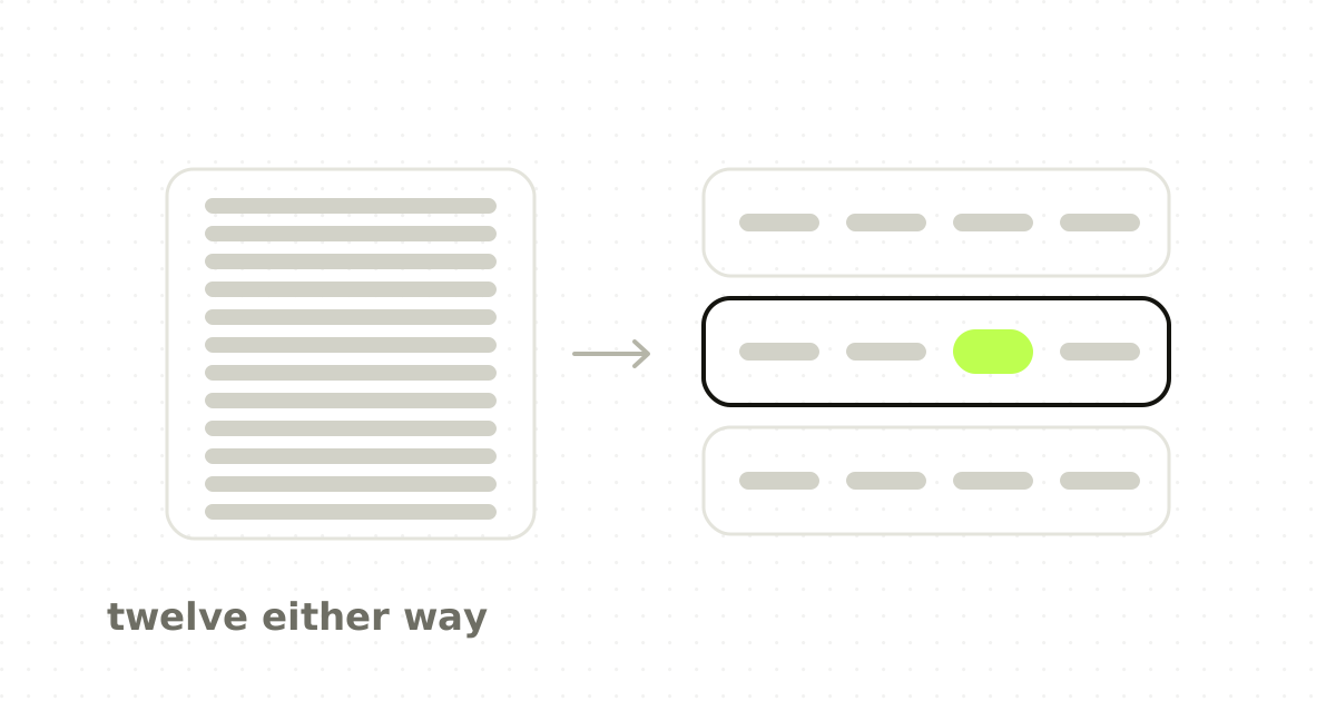
Split twelve options into three labelled groups of four and the user faces two decisions: pick a group, then pick within it. Each is drawn from a much smaller set. The total number of options on screen has not changed and nothing has been taken away.
This works only when the grouping is real. Labels have to be predictable enough that a user can rule out two groups without reading them, which is a content problem before it is a layout problem. Groups named Actions, Options and More fail, because deciding which of those contains the thing you want is a harder problem than the original list.
The test is whether a user can skip a group without opening it. If they cannot, you have added a step rather than removed one.
Where the law does not apply at all
Hick's law describes choosing among known alternatives. It says nothing about these, and applying it to them produces bad decisions:
- Reading. Scanning a page of prose is a search task, not a choice among alternatives. 2. Unfamiliar options. If the user does not yet know what each one means, they are learning, not choosing, and the cost is dominated by comprehension. 3. Unequal options. When one action is what ninety per cent of users want, a good default collapses the decision entirely and the option count stops mattering. 4. Expert, repeated work. A practised user is not deciding at all. They are executing a remembered path, and a dense screen is faster for them than a tidy one with more steps.
That last case is most of enterprise software. The analyst who runs the same triage forty times a day wants everything visible and nothing behind a menu.
What to do with a screen that genuinely has too much on it
The complaint that produced the Hick's law citation is usually real. The screen is hard. The fix is rarely fewer things.
- Group by the decision, not by the data model. Users navigate by intent. Objects and endpoints belong to your architecture, not their task. 2. Make the labels predictable enough to skip. If a heading does not let a user rule out its contents unread, rewrite the heading. 3. Set a default for the common case, and keep the rest reachable rather than hidden. 4. Separate first-run from routine use. New users need fewer choices; daily users need all of them. Progressive disclosure that never finishes disclosing is a tax on your best customers. 5. Count steps, not controls. Moving six buttons into a menu removes six things from the screen and adds a click to every one of them.
The point
Hick's law is a description of how choices behave, and it is being used as permission to remove things. Those are opposite activities. The law tells you that a well-structured set of many options costs a user very little, and that is a far more useful finding for anyone designing software that does real work.
When someone cites it in a review, the productive question is not which options can go. It is which decision the user is actually making, and whether the screen has been arranged around that decision or around the database.
Frequently asked questions
- What is Hick's law in UX design?
- Hick's law states that the time it takes to make a decision increases logarithmically with the number of equally likely, familiar alternatives. In interface design it is used to reason about how long a user takes to pick from a set of controls. It describes decision time only, and does not apply to reading, searching or using unfamiliar options.
- Does Hick's law mean I should reduce the number of options?
- Not usually. Because the relationship is logarithmic, each additional option costs less than the one before, so deleting a few items from a long list buys very little. Grouping the same options under predictable labels gives a much larger improvement, because the user makes two decisions from small sets rather than one from a large set.
- When does Hick's law not apply?
- It does not apply when the user is reading rather than choosing, when they do not yet know what the options mean, when one option is far more likely than the others, or when an expert is repeating a memorised path. Enterprise tools used daily fall into that last category, which is why dense screens often outperform simplified ones there.
- What is the difference between Hick's law and cognitive load?
- Hick's law is a specific, measurable claim about reaction time when choosing among known alternatives. Cognitive load is a broad term for the total mental effort a task demands, including reading, remembering and comprehending. Hick's law is one narrow contributor to it, and the two are often used interchangeably in design discussions when they should not be.
- There is no correct number, and the popular claim that it should be around seven comes from a misreading of a 1956 paper about short-term memory, not from Hick's law. The useful constraint is that a user should be able to rule out most of a menu without reading all of it, which is a question about labelling rather than count.
Sources
This thinking, applied
Share this