
A redesign is the biggest change you can make
"We need a redesign" is usually said after a bad quarter. Activation is flat, a large customer complained about the navigation, and the product looks older than the competitor that just raised. All three are real. Only one of them is a sign your SaaS product needs a redesign, and it is not the one about looks.
Nielsen Norman Group's long-standing advice is to apply the least change that solves the problem, because radical changes are more likely to break something users depend on. The same article names the exception: after years of incremental additions a product can lose its cohesiveness, and then a new architecture is the fix. The skill is telling which situation you are in.
This is about the product itself. The marketing site has its own version of the question, covered in your SaaS website probably doesn't need a redesign yet.
Three scales of change
I sort every "we need a redesign" into one of three scales before anyone draws anything.
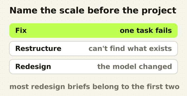
- Fix. One step, one screen or one task is failing. The rest of the product works and people know their way around it.
- Restructure. The parts work, but people cannot find them or cannot tell how they relate. Navigation, information architecture and naming are the problem.
- Redesign. The model the product was designed around is no longer the model the business sells.
Each scale has its own signals, and most of the signals founders read as redesign belong to the first two.
Signs you need a targeted fix
The drop-off is concentrated. Funnel data shows one step where people leave: the invite screen, the first import, the plan comparison. When loss clusters that tightly, the problem is local, and so is the fix.
Support tickets repeat one question. A ticket that arrives every week asking how to do the same thing is a brief written by your users. It names the task, and usually the screen.
One feature has low adoption and a visible reason. It sits behind a menu, carries an internal name, or is reachable only after a setup step nobody finishes.
None of these needs a redesign. They need someone to watch the failing task, which is what a UX audit should rank for you, followed by a change measured in days or weeks.
Signs you need a restructure
People cannot find features that exist. Pendo's 2019 feature adoption report, built from usage data across its customers' products, estimated that 80 percent of features in the average software product are rarely or never used. Pendo sells adoption tooling, so treat the number as directional. The pattern behind it is familiar: a feature can be well designed and still invisible.
The navigation mirrors the org chart. Every team that shipped something got a top-level item, so the menu describes who built the product rather than what people come to do.
The same job can be done three ways. Two filtering models, two kinds of table, three places to change a setting. Each was a reasonable local decision. Together they make people learn the product over and over.
New roles were bolted on. An admin area added for enterprise deals, a manager view added for one customer, each with its own patterns. The fix here is information architecture and a shared component system, not new visuals. It is the problem the HelloUI design system was built to solve across five product lines, where every team was rebuilding the same interface slightly differently.
Signs you genuinely need a redesign
The customer changed. You started with small teams and now sell to enterprises with procurement, permissions and audit requirements. A product designed for one person clicking around does not stretch to a buyer with five stakeholders.
The core workflow changed. The product was built around one person completing a task and is now used by a team handing work between people. The object at the centre of the product moved.
Incremental change has stopped working. Every new feature takes longer to fit, and design reviews end with "there is nowhere to put this". That is the loss of cohesiveness NN/g describes, and it is the one situation where more small fixes make things worse.
What is not a sign
The product looks dated. Visual age alone calls for a refresh, which changes type, colour and spacing and leaves the structure alone. It is a far smaller piece of work.
A competitor redesigned. Their redesign answered their problem.
One loud customer. Weigh the complaint against the analytics and the support queue before it sets the roadmap.
A new leader's taste. It may be right. It still needs the same evidence as everything else.
If you do redesign, protect what people already know
People who use a product every day have learned it, and a redesign spends that learning. Aaron Sedley, writing about his experience at Google, calls the backlash change aversion, and argues it is mostly a reaction to change handled badly: no warning, no explanation, no way back and no follow-up.
The practical version for a B2B product:
- Tell people before it ships, with what changed and why.
- Keep the old version reachable for a period, where you can afford to.
- Release to a slice of accounts first and watch the tasks, not the satisfaction score.
- Keep the keyboard shortcuts, column orders and saved views, which is what power users actually lose.
- Measure the tasks you redesigned for before and after, so the argument about whether it worked has data in it.
The point
A redesign is the right answer when the product's model has changed. For almost everything else it is the most expensive way to fix a local problem, and it resets what your best users already know.
Name the scale before you name the project. If you cannot tell which one you are in, that is the question a UX audit exists to answer, and it costs far less than finding out halfway through a redesign.
Frequently asked questions
- How do I know if my SaaS product needs a redesign?
- A SaaS product needs a full redesign when its underlying model has changed: a new customer segment such as enterprise buyers, a new core workflow, or so many incremental additions that new features no longer fit. If users fail at one step, cannot find existing features, or send repeated tickets about one task, a targeted fix or a navigation restructure is usually the better answer.
- What is the difference between a redesign and a refresh?
- A refresh changes the visual layer of a product, such as type, colour, icons and spacing, and leaves workflows and structure alone. A redesign changes how the product is organised and how tasks are done, including navigation, information architecture and core flows. A refresh suits a product that works but looks dated. A redesign suits one whose structure no longer matches how customers use it.
- How often should a SaaS product be redesigned?
- There is no fixed schedule, and redesigning on a calendar is a common way to waste budget. Nielsen Norman Group advises applying the least change that solves the problem, and reserving radical redesigns for when years of incremental change have made a product incoherent. Most SaaS products are better served by continuous improvement with an occasional structural reset.
- Should we do a UX audit before a product redesign?
- Yes, for any product with real users. A UX audit shows which tasks are failing, why, and at what cost, which tells you whether the answer is a targeted fix, a restructure or a full redesign. An audit is a few weeks of work, compared with months for a redesign, and it often narrows the redesign's scope enough to pay for itself.
- How do you redesign a product without losing existing users?
- Announce the change before it ships, explain what changed and why, keep the old version reachable for a transition period where possible, and release to a small group of accounts first. Preserve what power users rely on, such as keyboard shortcuts, saved views and column orders, and measure the redesigned tasks before and after launch.
Sources
This thinking, applied
Share this