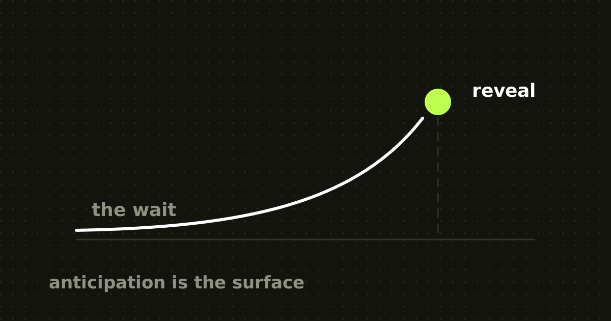
The animation is doing architectural work
Apple introduced a foldable iPhone this week, and one of the most discussed details is not the hinge. It is what the software does while the hinge is moving.
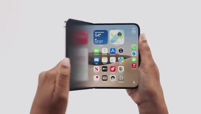
Open the iPhone Duo and the interface does not simply vanish from the outer display and reappear on the inner one. The content passes through a progressive visual transition before resolving into the larger layout. Early hands-on coverage described it as gradually coming into focus as the device reaches its open position, and designers immediately started isolating the animation and replaying it.
It is easy to conclude that Apple added a nice blur. I think that misses the useful lesson.
The blur is not the interesting part. The interesting part is that Apple has a difficult state-change problem, and instead of leaving users to mentally connect state A with state B, the interface carries them across it.
When the Duo opens, the user has not navigated anywhere. They have not selected a page, opened a modal or changed task. They have changed the physical shape of the computer, and the interface now has to move from a small outer display to a larger inner one while preserving their understanding of where they are and what happened to everything on screen.
That changes the question. Not how should this transition look, but what does the user need to keep understanding while the interface changes.
Apple does not tell designers to blur anything
This distinction matters, because Apple's own Duo documentation does not present progressive blur as a principle. The principle is continuity.
Apple describes the two displays as sharing an aspect ratio so content scales proportionally. Its guidance tells developers to preserve functionality and element state between displays, maintain information hierarchy, and let existing layouts expand rather than reinventing the app for each device pose. It goes further and says to avoid extreme layout changes as people fold the device: move only what is necessary, because controls that vanish or jump are harder to find and track.
That is almost the opposite of how motion often gets treated. A team builds two layouts, then someone asks whether the transition could be more exciting. Apple's guidance starts earlier. The two states have to share enough structure that continuity is possible at all.
Animation cannot rescue two interfaces that have no relationship to one another. That may be the most important lesson in the whole transition.
The user moved the hardware. The software explains the consequence.
Most responsive design is invisible. Rotate a phone, resize a browser, cross a breakpoint, and the layout recalculates. From the browser's perspective that is fine. From a user's perspective, a large enough transformation creates a different problem: where did everything go?
The Duo exaggerates this because the trigger is physical. A person begins opening the device with their hands. The canvas expands, controls may reorient, columns can appear, content reorganises around the hinge.
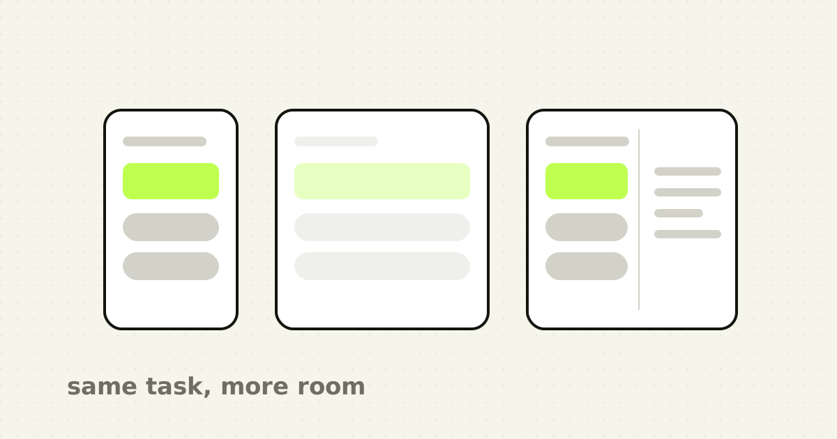
So the interaction is not small interface becoming new interface. It is the same task, in a changing environment, arriving as an adapted version of itself. Motion makes that relationship visible.
Apple described the idea more broadly before the Duo existed: when someone moves between devices or resizes a window, they are continuing the same task rather than starting over, and the interface should carry that forward instead of treating the new environment as a restart. The Duo just makes it unusually easy to see.
Motion earns its place when two correct screenshots would still confuse
A lot of motion critique happens from screenshots. Does the closed state look right? Does the open state look right? If both answers are yes, the design gets approved.
But nobody experiences a product as two frames on a board. They experience state A, then something happening, then state B. The middle matters.
Nielsen Norman Group draws a similar distinction: motion can help people build mental models, communicate state changes, give feedback and establish spatial relationships, while the same ability to attract attention becomes distracting when used carelessly.
There is experimental support for the underlying perceptual mechanism too. In controlled studies of statistical graphics, Heer and Robertson found that appropriately designed animated transitions improved people's perception of changes between related visual states. That research was about data visualisation rather than foldable phones, so it should not be stretched into a universal law, but the problem is recognisable: when two views represent related information, showing how one becomes the other makes the relationship easier to follow.
This is where teams underuse motion. They animate buttons, cards, menus and hero sections, then leave the cognitively expensive changes instantaneous. A filter rewrites an entire table. A dashboard switches context. A mobile flow becomes a desktop split view. An AI operation transforms content the user wrote. Those are exactly the moments where someone needs help understanding what changed.
The transition creates a temporary abstraction layer
There is a part of the fold animation I find more interesting than the blur itself. During the physical transition, reading the interface is temporarily less important.
The viewport is changing continuously. Layout calculations are happening. Components are finding new positions. The final interface is not stable yet. Preserving perfect visual detail through every intermediate frame would expose information that has almost no value.
So the transition reduces that detail. The interface becomes less literal before becoming clear again. I think of it as a temporary abstraction layer, and the distinction from hiding a slow frame rate matters: the point is not to mask performance, it is to avoid asking the user to interpret unstable information.
Picture a B2B dashboard moving from a single column to a three-pane workspace while every intermediate width stays perfectly sharp. A label wraps. A chart stretches. A panel jumps. Navigation moves. Numbers reposition. A second column appears. Technically every frame is correct. Perceptually, the user just watched the implementation happen.
Sometimes showing less during the transition communicates more. That is not permission to blur every breakpoint. Apple's own guidance recommends avoiding unnecessary rearrangement in the first place. The best transition starts with good adaptive architecture and uses motion only to bridge what still has to change.
Software sharing the same cause, not just following it
There is an interaction principle underneath all this: cause should stay legible.
The user physically opens the phone. At the same moment the digital environment expands. Those two events belong together. That sounds obvious until you compare it with an interface that waits, cuts, redraws and presents the larger layout after the physical action has finished. Then the software feels like something running inside the object. When it responds progressively to the same physical action, it starts to feel like a property of the object.
Apple has been moving toward this for years. Its earlier animation guidance introduced transitions where a selected source element stays visually connected to its destination, so a tapped cell expands into the next view rather than being replaced by an unrelated screen animation.
The Duo adds a dimension. The cause is no longer only a tap on glass. It is the device changing geometry, with hinge state exposed to software while separate layout systems handle the changing usable regions. That separation is smart: physical input can drive meaningful behaviour without every developer hand-animating layout coordinates. The system understands the cause, the layout understands the constraint, and the transition explains the relationship. That is interaction architecture, not decoration.
Apple did not invent continuity on foldables
Worth saying, because Apple discussions tend to erase what came before them.
Android's foldable guidance has described app continuity for years: when a device folds or unfolds, the app should preserve state so the user resumes the same task without disruption. Its example is plain. If the folded display shows a product and its description, the unfolded state should preserve that content and add complementary information rather than starting over. Material Design has long described motion as a way to establish spatial relationships and preserve continuity as objects transform.
So keeping my place when I unfold my phone is not a new idea, and neither is meaningful motion. What is interesting about Apple's execution is the degree of integration: deliberately related display proportions, an operating system that adapts controls around the hardware, one display engine driving both panels, the hinge as an interaction input, layout APIs aware of folding regions, and a transition that choreographs the visible handoff.
The innovation is not that Apple discovered animation. It is that physical transformation, layout transformation and visual continuity were treated as one design problem. That is the part worth stealing.
Perceived performance is real, but the 300ms claim is too simple
There is a popular idea that animation makes the same technical delay feel faster. There is truth in it, and it gets repeated too casually.
Research published in the Journal of Consumer Research tested how animation speed changes perceived waiting in digital experiences. Across experiments, moderate-speed loading animations produced shorter perceived waits than static, slower or faster alternatives, and the researchers connected those effects to outcomes including conversion and product evaluation.
That is useful evidence. It does not prove that any 300-millisecond animation turns latency into delight. The studies examined repeated loading animations during incidental waits, which is a different interaction from a fold transition.
What it reasonably supports is this: people do not experience system time only as a stopwatch. Attention, feedback and the visual explanation of what is happening all affect how waiting is perceived. A frozen interface gives no causal information. A responsive transition says the action was received and something is changing.
Animation should never become an excuse for slow software. The best perceived-performance strategy is still actual performance. Motion can explain necessary time. It should not manufacture it.
There is a point where Apple's own advice says stop moving
The blur also exposes a constraint that is easy to overlook while everyone replays the animation. Motion is not equally comfortable for everyone.
Apple's accessibility guidance asks apps to respond to the system Reduce Motion preference, and its App Store accessibility criteria specifically call out depth simulation including animated blur, recommending those effects be disabled or changed when reduced motion is requested.
That produces a useful rule. If understanding the state change depends entirely on your animation, the interaction is fragile. The reduced-motion version still has to explain what happened. Perhaps the transition becomes a short dissolve, or layout changes are staged with less movement, or a selected object takes a temporary highlight, or the new state is simply clear enough that motion can disappear.
Apple's criteria make a distinction worth keeping: when motion communicates meaningful status or hierarchy, the answer is not necessarily to remove all feedback, but to provide an alternative with less movement.
Accessibility is therefore a good test of whether your animation has a purpose at all. If you cannot say what information it carries, you probably cannot design its reduced-motion equivalent either.
The state bridge test
I have started thinking about meaningful product motion as a state bridge. Before animating a major interface change, five questions.
- What caused the change? The transition should feel connected to the tap, gesture, system event, physical action or data update behind it. Movement with no relationship to a cause is theatre. 2. What must feel unchanged? Preserve the task, the selected object, the position, the data or the mental model wherever possible. Continuity works because some things survive. 3. What actually needs to move? Move only what is necessary. Do not animate the whole screen because the tool makes it easy. 4. Where should attention land? Motion is extremely effective at pulling attention, so spend that deliberately. The final frame should make the next relevant action obvious rather than leaving someone watching decoration. 5. What happens with Reduce Motion enabled? If the information disappears when the animation does, redesign the communication rather than ignoring the setting.
That test works well beyond foldable phones. An AI writing tool replacing a paragraph could preserve the selected region and make the transformation legible instead of swapping old text for new. A reconciliation dashboard that removes a matched payment from an exception queue could let the resolved row acknowledge success and exit while the rest settle predictably, rather than snapping the table upward. Switching from overview to detail could keep the selected object spatially connected to its destination.
These are motion questions. They are also information-architecture questions.
The screenshot is no longer the whole interface
Design tools trained us to judge interfaces as states. Frame 01, frame 02, frame 03. Engineering receives those frames and invents whatever happens between them.
That model is increasingly incomplete. Products now adapt to screen size, device posture, keyboard state, window size, live data, AI generation, multitasking, permissions, background processing and physical sensors. The space between stable screens holds more product behaviour than it used to.
The Duo makes this visible because the screen physically changes while someone is looking at it, but the same problem exists in ordinary software. A dashboard loading real data is a transition. An AI answer streaming into an empty workspace is a transition. A bulk action updating two hundred records is a transition. A permissions change removing actions is a transition. An optimistic save that later fails is a transition.
Left to default browser behaviour or a generic fade, those moments are simply undesigned. It is the same gap as the empty state nobody was assigned: a state every user passes through, owned by no one.
What to take into your next sprint
Do not start by auditing where your product lacks animation. Audit where it has large state changes. Look for moments where something changes location, scale, hierarchy, ownership, status or context, then ask whether someone could understand the relationship between before and after without already knowing how the system works. If not, you may have found a use for motion.
Start with continuity before animation, preserving state, hierarchy and familiar controls first. Connect movement to cause: if a card opens, let the next state emerge from that card; if hardware changes, let software respond to the same physical event. Use motion to reduce uncertainty rather than to add spectacle. And test the interaction with motion reduced. If the product still makes sense, the animation is supporting the architecture. If everything falls apart, the animation was hiding it.
The restraint this requires is the same judgement as deciding where a product should look familiar and where it should not. Not every button needs to bounce.
The point
Everyone noticed the blur because it looks good. That is fair, it does. But make the transition blurry is probably the least useful thing a team could copy.
Apple had two dramatically different interface states and a physical event connecting them, and instead of treating them as separate screens, the system works to maintain continuity: same task, same hierarchy, same controls where possible, changing environment. Its documentation is consistent about that across displays, across window sizes, and in navigation where source and destination stay visibly related.
Motion is useful when it explains that relationship. Not every card needs to float and not every page needs a transition. But when a product asks someone to understand a meaningful change, the frames between the frames are part of the interface too.
The best product motion does not announce itself as animation. It makes the next state feel like the inevitable consequence of the last one, which is the same reason a well-chosen default does so much work without ever being noticed.
Frequently asked questions
- What is the iPhone Duo fold animation?
- It is the progressive visual transition the interface passes through while the device moves between its folded and unfolded positions, rather than content cutting from one display to the other. Early hands-on coverage described content gradually coming into focus as the device reaches its open position. Its purpose is continuity: preserving the user's sense of place across a change they caused physically.
- Why does the iPhone Duo blur the screen when it opens?
- Apple's own Duo guidance never names blur as a principle; it names continuity. During the fold the viewport is changing, layout is recalculating and components are still finding position, so the final interface is not stable. Reducing visual detail through that window avoids asking the user to interpret information that is momentarily meaningless.
- What can product designers learn from the iPhone Duo transition?
- That motion is most valuable at large state changes, not on buttons and cards. The transferable practice is to preserve state, hierarchy and familiar controls between the two states first, then use movement only to bridge what genuinely has to change, and to connect that movement to whatever caused it.
- Should every interface transition be animated?
- No. Apple's guidance for the Duo recommends moving only what is necessary and avoiding extreme layout change, because controls that jump are harder to track. Animate where someone would otherwise struggle to relate the before and after states. Decorative motion competes for attention that a real state change may need.
- How does Reduce Motion affect animated transitions?
- Apple's accessibility criteria identify depth effects including animated blur as motion that should be disabled or altered when Reduce Motion is enabled. The practical implication is a design constraint: if the state change is only comprehensible through the animation, the interaction is fragile. The reduced-motion version still has to explain what happened.
Sources
This thinking, applied
Share this